(Update 1/18/12) For a French translation of this post please click here for a downloadable PDF file:
How light works is one of the "sciences" (like anatomy or perspective) that a representational artist should be somewhat familiar with. It is a subject that I have spent a good amount of time studying and is something I conceptualize during very painting I work on.
The following is the first part of a two part article I was asked to write for the Portrait Society of America. It was originally published in the
Journal of the Portrait Society of America, Volume XI, Issue No. 46.
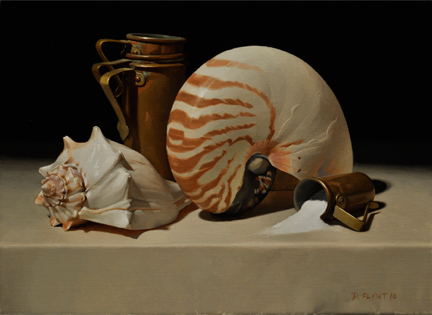
The Anatomy of Light on Form: Part I
by Douglas Flynt ©2009
To better understand the appearance of objects, including their color relationships, artists need to study light and how it interacts with forms or objects. Understanding what is occurring gives an advantage of clarity, both in thought and expression, over the artist who does not possess the same knowledge—much in the same way that the figurative artist who knows anatomy is at a clear advantage over the artist who does not. This article's first part focuses more on what is occurring as light interacts with an object, while the second part will focus more on how artists can apply this knowledge.
Visible Light
Visible light represents a small portion of the electromagnetic spectrum that is observable to the human eye. Many people will recall at some point seeing a prism used to create a rainbow through the process of refraction. This demonstrates that visible light is actually composed of many different wavelengths—starting with the higher frequencies of violet and then shifting through blue, green, yellow, orange and finally into red. The combination of these wavelengths, in their various proportions, make up the color of light we perceive.
Temperature of Light
Light is often referred to by "temperature," as measured by the Kelvin scale (represented as "K"). Lower temperatures start with red and increase through orange, yellow, green, and finally to blue. However, because of visual color associations artists refer to the lower temperatures (toward red) as warm and higher temperatures (toward blue) as cool. An incandescent bulb is considered "warm" at approximately 3000K, while sunlight is considered only "slightly warm" at approximately 5000K and north light is considered "cool" at approximately 7000K or higher.
Specular and Diffuse Components of Light
When light strikes an object some of the light is reflected directly from the surface of the object in the form of "specular reflection" simply known to artists as glare or a "highlight." This highlight is composed of the same wavelengths that originally struck the object and so retains the color of the light source. (Metals are an exception with some absorption of the original wavelengths causing the highlight to take on the color of the metal).
The remaining light that does not reflect from the surface penetrates into the object where it is reflected within the material multiple times in a process known as "subsurface scattering." During these multiple reflections within the material some of the wavelengths are absorbed by its atoms, usually re-emitted later as infrared wavelengths that we feel as heat. Unless they pass through the material, the unabsorbed wavelengths are eventually reflected back out of the material as "diffuse reflection," more commonly know to artists as "form-light." This diffuse reflection generally defines the object's "local-color."
The combination of these diffuse and specular components, and the degree to which each is present, makes up the appearance of the object. Specular literally means "mirror like" so that an object that shows only specular reflection (consequently no diffuse reflection) has a mirror like appearance, reflecting anything in the room that is emitting light. However, most objects display both specular and diffuse reflection with the specular reflection obscuring the diffuse reflection in places. The degree of this obscuring is dependent on the roughness or smoothness of the object's surface; and it's location is dependent upon the location of the viewer relative to both the object and the light source.
The light composing a specular reflection is reflected from the surface of an object at the same angle that it strikes the surface (angle of incidence equals angle of reflection). If this striking angle aligns to reflect the light into the viewer's eye they will see this glare, if not, they will see only the light comprising the diffuse reflection. (Figure 1)
Figure 1
Because of this spatial geometry highlights appear to move as the viewer moves—changing the spatial geometry between themselves, the object, and the light-source. This is not the case for diffuse reflection which appears the same regardless of the viewer's location. This isotropic quality is because of the scattering that occurred within the material causing the light to exit at many different directions.
The smoother the object's surface (as with a glossy surface) the more the highlight will appear to hold together in a single brilliant unit. A rougher surface with its micro-facets (such as a matte surface) will reflect the specular light rays in numerous directions breaking up the highlight so that it appears weaker and weaker, or not at all, as it spreads out over a wider area.
When working from life these qualities are useful in determining what one is seeing. If it appears to move across the object as you move, it is a highlight, if not, it is form-light. Highlights are the color of the light source (except metals) and, as they diffuse, we see the local-color of the object as form-light.
The Darkening of Form-light's Local-color Through Angle and Distance
When studying form-light, the amount of light any given area of the object receives to begin with determines how true the local-color can be perceived. With form-light, the more an object faces the light source the more it will reveal its local-color.
As the surface angles away from the light source fewer light rays, or streams of photons, can strike any given unit of surface area (Figure 2).
Figure 2
Fewer striking light rays means less light is later re-emitted to carry the information about the local-color of the object to our eye. Absence of light is perceived as darkness or achromatic blackness—as when all lights are turned off. With less light reflecting the local-color back to the viewer's eye the amount of darkness increases causing the local-color's appearance to simultaneously darken in value and weaken in chroma (sometimes described as a temperature shift).
The rate at which this occurs is not a steady progression. The light diminishes exponentially with the rate of decrease in light accelerating as the object's surface angles further from the light-source. To visualize this rate of decrease imagine a globe placed directly under a skylight so that the "terminator," or shadow line, is at the line of the equator. A 10 degree move away from the North pole toward the equator would suffer a 2 percent loss of light, while the same 10 degree distance just before the equator would suffer a loss of 17 percent (Figure 3).
Figure 3
When the surface of an object turns away from the plane most facing the light by 60 degrees, the amount of light present will have decreased by exactly half. Prior to this critical angle the colors perceived may be termed "lights" while after this angle the colors perceived are often termed "halftones" (Figure 3). Within the halftones, right before the terminator is reached, this increasing rate of light drop-off can be accelerated by a phenomenon known as a "penumbra," where the surface is no longer geometrically exposed to the entire aperture of the light source (Figure 4).
Figure 4
Additionally, an increased distance between the surface of an object and the light source also contributes to an absence of light. If the light source is far enough away (such as the sun) all the rays striking an object will be approximated as parallel. However, because light rays radiate from their source, spreading apart from one other, a unit of surface area moved further from the light will experience fewer light rays striking it (Figure 5).
Figure 5
Again, there is now less diffuse reflection to carry the information about the local-color of the object to our eye causing a perceived darkening in value and weakening in chroma.
Additional Phenomena and Conclusion
There are still a number of light based phenomena that could be discussed such as "specular transmission" and "diffuse transmission" which distinguish a material as being "transparent" or "translucent" respectively. Additionally, we find that "specular inter-reflection" and "diffuse inter-reflection" are known respectively to artists as "reflections," and "reflected-light." However, the length of this article does not allow for them or many other subtleties. It should be noted that what has been stated has been catered toward visual artists and should not be taken as a definitive stance regarding the subject of light but more of an orientation about how it shapes our perceptions of the objects we see.