Monday, May 19, 2014

Cheating On My Cadmiums: Why I Replaced My Cadmium Paints


When I was an art student studying in New York City I dreaded having to purchase cadmium colors — as the proverbial starving artist I cringed at the price tag for them.  At that time any money was too much money.   But at some point I decided they were necessary and justified buying a cadmium red and a cadmium yellow light. I made do with just those two pigments for a number of years and they gave me that extra punch of chroma or intensity whenever I needed it. After awhile I found them a necessity for many projects.  At some point I ended up also adding cadmium orange to the mix. But still every time I went to repurchase them I found myself cringing at the price tag. However, by this point we had become old friends and despite the price I was so accustomed to their hue, value and chroma attributes that I automatically added them to my cart without much reservation whenever I needed a new tube.

A couple of months ago I started doing some tinkering with the colors on my palette and decided that I might look into some alternatives for my cadmium paints. And after trying a handful of different colors I finally settled on replacements for cadmium red and cadmium yellow light.  I thought I’d share those results in case there are others out there who also wanted to begin phasing out their cadmiums.

For cadmium red (PR108) I’ve replaced it with Scarlet Lake (PR255), also known as coral red or sometimes Pyrrole Scarlet.  From the reading I’ve encountered it appears to be quite lightfast receiving an “ASTM I rating.”  I like that although its hue is very similar to cadmium red light (which makes it feel familiar to me) its chroma is actually a bit higher and continues to hold up well with the addition of white paint — at least as well as the cadmium red I’ve been using.


For cadmium yellow pale/light (PY35) I have replaced it with Winsor yellow (PY74), also known as Hansa yellow, Arylide Yellow or Azo yellow. This one also receives an “ASTM I” rating which I’m pleased about. And although its hue appears to display slightly less of an orange trace, when compared to cadmium yellow light, it is still close enough in hue that it, again, feels familiar to me.  It also has a slightly higher chroma than cadmium yellow light, giving me just a touch more color-space range.


Now if the characteristics above were not enough to get me to make the switch, the price for them added that extra incentive I needed.  Both of these generally run under half the cost of their cadmium counterparts, and for the remnants of that starving artist I once knew so well, this makes me very happy!

Despite trying a few alternatives I’ve still yet to find a good replacement for cadmium orange — so I suppose it will still linger on my palette until I do so. If anybody has found a good replacement for it I would love to hear your suggestions.


Did you enjoy this post?

Join My E-mail List


Wednesday, January 8, 2014

A Quick Brushwork Tip for Artists and Two Great Books to Read


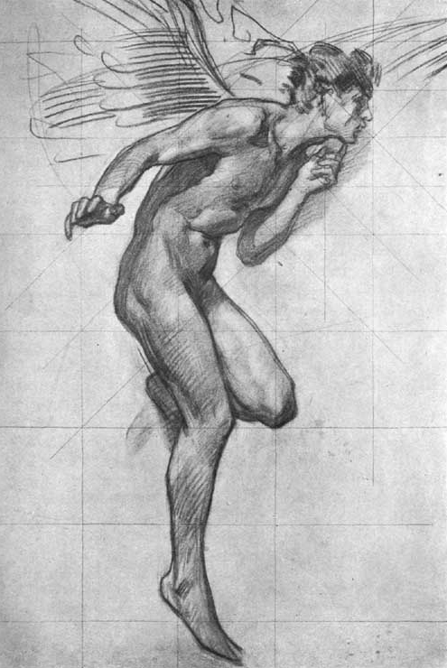
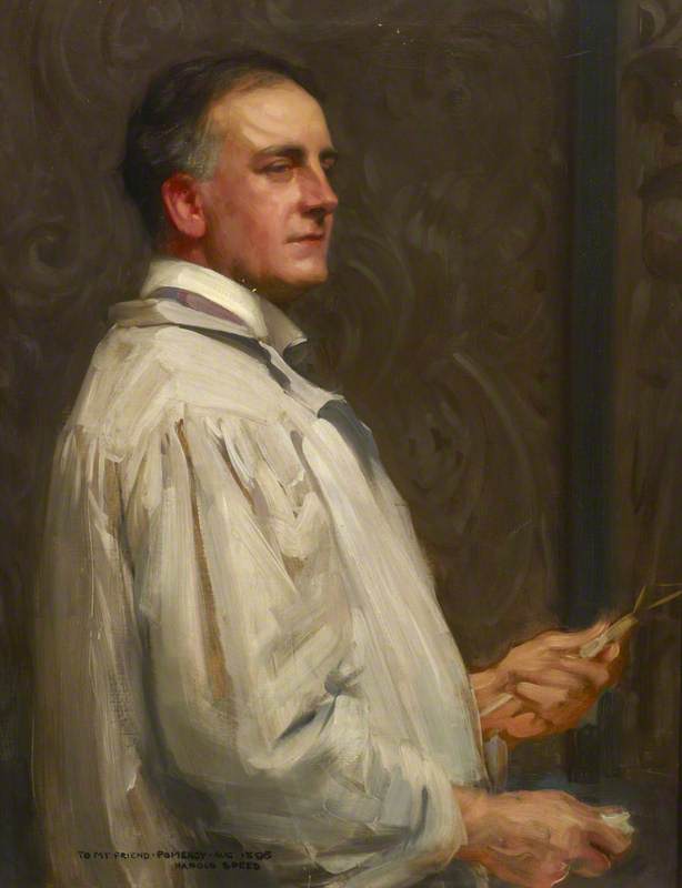
The images in the post are works by the artist Harold Speed (1872 -1957).  I've referenced him before in my post titled The Optical and Conceptual: Components of Perception.  You can read that post by clicking "here."

Study for figure of Boreas by Harold Speed


Much of the time while I am painting, brushstrokes are constantly cutting across one another. Yesterday while I was painting I recalled a statement by Harold Speed from his book Oil Painting Techniques and Materials.  In the passage I was recalling he was describing “painting such details as the under eyelid…” And made the point that “Generally speaking, remember that you can only attend to one edge of the touch that you are making.  If you try and paint a touch that needs variety on both its edges, and you try and get the variety on both sides at the same time, you will fail to get either right. ” In essence when we place a stroke of paint we can only focus on the exactness (drawing and placement) of one of its edges at a time. To get the other edge to be exactly as we wish we can then recut into it with the next stroke of paint.  This is such a simple and obvious thought and yet it can be tremendously helpful at times.

Frank Pomeroy, 1898 by Harold Speed


Within the classically-based art circles I’ve been most associated with, Harold Speed’s two books, The Practice and Science of Drawing and Oil Painting Techniques and Materials, are well-known and widely read. If you are a representational artist and you’re not familiar with his books I would highly recommend them. The Practice and Science of Drawing can be read online for free here:


or here:


Even though I don’t necessarily paint in the exact manner prescribed by Harold Speed, I find his books are full of insightful material—every time I go back to them I seem to pick out some new bit of information. If you’ve got any useful insights or tips you’ve gained from reading either one of his books I’d love to hear about them in the comments below!


Wednesday, December 11, 2013

A Paint Sketch and its Role During a Commission

Recently I shared an image on Facebook.  I had originally intended to only post it there, but I was surprised by the amount of interest it received.  For this post I wanted to share that image which I believe may be interesting to both collectors and fellow artists alike.

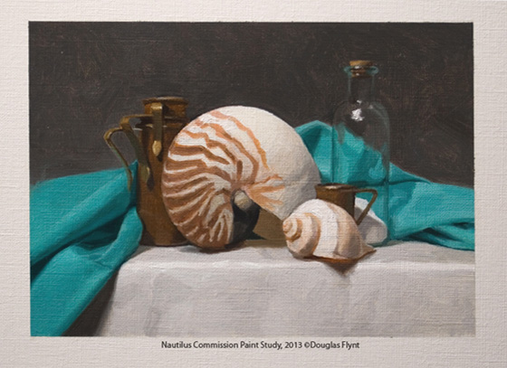
The image below is small 5” x 7” paint sketch. Very often for commissioned work before I start the actual painting I will complete a sketch like this and present it to the client. Ideally, I prefer to present the actual sketch, rather than a photo of it, since a photo can appear quite different from monitor to monitor. Of course the commissioned painting will be considerably more detailed and carefully executed. However, a sketch like this gives a feel for the composition and colors I intend to use and I want to make sure the client is happy with the direction of the project before investing any significant time into the actual painting. With respect to this study, the client has already shared their approval and so I am moving forward!

I hope you enjoyed seeing the image and thanks for taking a look!


Friday, November 1, 2013

Painting a Still Life Video now Available & New 2014 Workshops


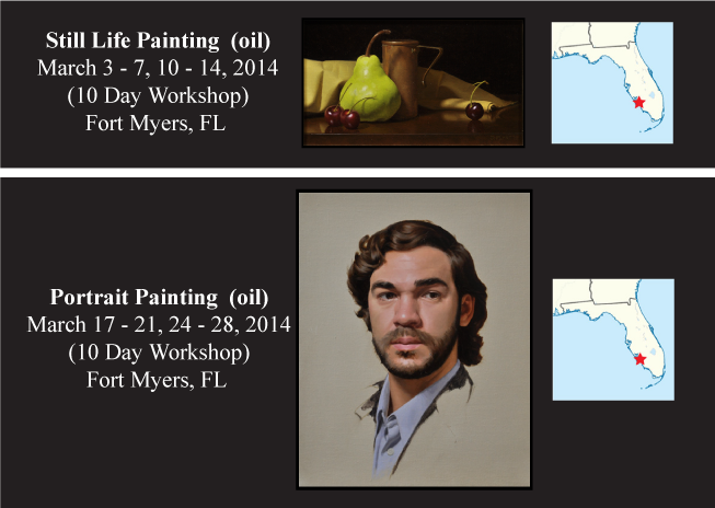
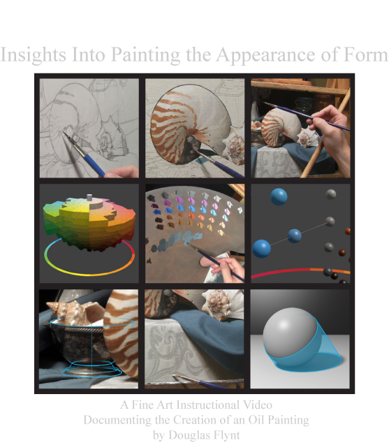
I have two items to share in this quick post.  My "Painting a Still Life" video is now available on my website for purchase as a download and I have added two workshops to my 2014 calendar!

For the video I worked hard to pack as much content as I could into its roughly 74 minute time frame. It documents the creation of one of my still life paintings—taking the viewer through each of the stages involved in the creation of the artwork. Along the way I share a number of insights about my thought process and the concepts I utilized while working.

If you would like to see more details about it please visit my website by using the following link:


You can also watch the preview below if you would like:


As for the workshops, they will be held back to back—so that you might attend both if you would like. 

For more information please click "Here" 


Thanks for taking a look!

Tuesday, October 15, 2013

"Painting a Still Life" Video Preview


I am pleased to share a preview for my upcoming instructional video first announced a few weeks ago. 

With the final edits being made, I can now share that it will be available for purchase as a download from my website on October 28, 2013:

I hope you enjoy the preview!


Saturday, September 28, 2013

Still Life Painting Instructional Video


I am pleased to share that I have a new instructional video in the works. I have had numerous requests for instructional videos and this will be my first release. I am hoping it will offer insight into not only my current painting process but also a number of the ideas I consider during the creation of an oil painting. Over an hour in length, it will be available as an instant downloadable video. The exact release date along with other details are still to be announced. If you would like to receive updates, including a notification when the video is available, please consider joining my e-mail list by visiting the link below:

Join Douglas Flynt's Mailing List

The painting featured in the video is currently available through Scottsdale Fine Art:

7116 E. Main Street
Scottsdale, AZ 85251


Sunday, November 25, 2012

Newly Available Paintings


For this post I wanted to share a few newly available paintings.  The John Pence Gallery in San Francisco will be looking to find homes for them.

If you have an interest in acquiring one (or more) of these pieces for your own collection please contact the gallery:

John Pence Gallery
750 Post Street . San Francisco . California 94109
Phone: 415.441.1138 | Fax: 415.441.1178
Hours: 10 am to 6 pm (Mon - Fri), 10 am to 5 pm (Sat)

If you are in the area and would like to see them in person please stop by the gallery.

Below you will find images of each piece, with and without their frames, along with pertinent size and medium information.

Regardless if you are, or are not, looking to acquire a new painting for yourself (or someone else) at this time I hope everyone will enjoy seeing these new works!

Thanks for stopping by!


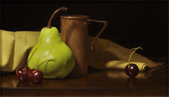
Pear and Cherries
Oil on Mounted Linen
6" x 10"


Two Tigers
Oil on Stretched Linen
10" x 14"


Sand and Shells
Oil on Stretched Linen
10" x 14"