When teaching workshops related to portraiture or figure
painting, I often encounter artists who feel somewhat mystified by the colors
they see in skin. From a naturalistic standpoint skin follows all the rules of
physics that any other material does. So like any other material, once we have
a better understanding of skin, we can begin to demystify the colors we see.
I generally encourage the artists I work with to think in
terms of identifying a local color specific to the region of form(s) they are currently
painting. This local color can then help guide their color choices rather than their
reacting moment-by-moment to the colors they feel they see. From a somewhat
simplified standpoint I would encourage painters to consider three main
variables when accounting for the local color of a given region: (1) the
amount of blood present, (2)the amount of pigmentation, and (3) the color of the
skin itself (devoid of or with low
amounts of blood or pigmentation). There are, of course, variations between
these as we visually detect more or less of each.
In this post I will try to expand upon these variables in
order to help explain what local colors are really present in skin and why. In
subsequent posts I would like to discuss how narrow the color range of skin
really is under average lighting conditions, and also how a regional local
color, when combined with various modeling factors, gives us the full range of the
colors we experience visually when looking at flesh tones.
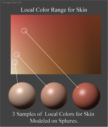
The following diagram shows a range of local skin colors in
addition to spheres illustrating the modeling factors seen for 3 different
local colors selected from this gamut.
The Local Color of
Skin Absent Blood or Pigmentation:
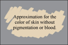
I want to start with a discussion of skin imagined with an
absence of blood or visible pigmentation. This concept of skin as a "local
color" stands as the blank canvas for every individual—regardless of
ethnic background. To this we can add factors of blood and pigmentation. Of
course in reality this "local color" in its most ideal state is
perhaps impossible to fully experience. Even in cases of albino individuals (illustrated in the
following images from Wikipedia[1]), who
lack any pigmentation, the blood in the skin will affect the color we see.


However, in order to obtain a sense of the skin color to
which I am referring, first locate a place on your body that has little visible
pigmentation—perhaps the palm of the hand, or some other area that receives
little sun exposure. This will, of course, be easier for lighter skinned
individuals. On this area apply a generous amount of pressure to displace the
blood from the region and then remove the pressure. For a brief moment, before
the blood returns, the color you observe will begin to offer a sense of the
local color we are conceiving of at it's most extreme state. Trying to classify
this color can be a bit tricky. Most scientific accounts of which I am aware
typically only say that skin by itself is yellowish in color. I would narrow
this down more by adding—from my own experience—that skin by itself is rather
light in value and more orangish-yellow rather than the yellow it is often described
as. By itself, it also generally offers the lowest chromatic intensity of any
local color observed in skin.
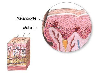
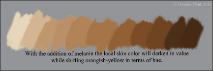
Melanin as a Pigment:
Within the epidermal, or upper layer of our skin, we find
melanocytes or cells that produce melanin. This melanin is responsible for helping
to protect us from the sun's ultraviolet rays. Although everyone, regardless of
ethnicity, has approximately the same number of
melanocytes, the production rate, size, and type of melanin pigment they
create, is what offers the visual color differences between various individuals.
The two types of melanin produced are pheonmelanin which is
often described as light yellow, tan or even reddish yellow and eumelanin which
is alternatively described as dark brown or even black. After reviewing a
number of descriptions and various charts showing the wavelengths both types
absorb, it would appear that they show more of a marked difference in terms of
value rather than hue. The result is that, in general, the addition of melanin of
either type contributes toward skin darkening in value while shifting its hue
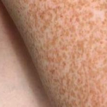
toward an orangish-yellow. To get a better sense of the color they contribute
try looking at moles and freckles. These can offer some sense of their color
since their appearance is brought on by an increased amount of melanin.
For each individual this melanin production will affect the
overall skin color. Additionally, within a particular individual, areas that
get more sun exposure will produce more melanin. The result is that these areas
will be darker in value than the paler skin regions with little visible blood
or melanin.
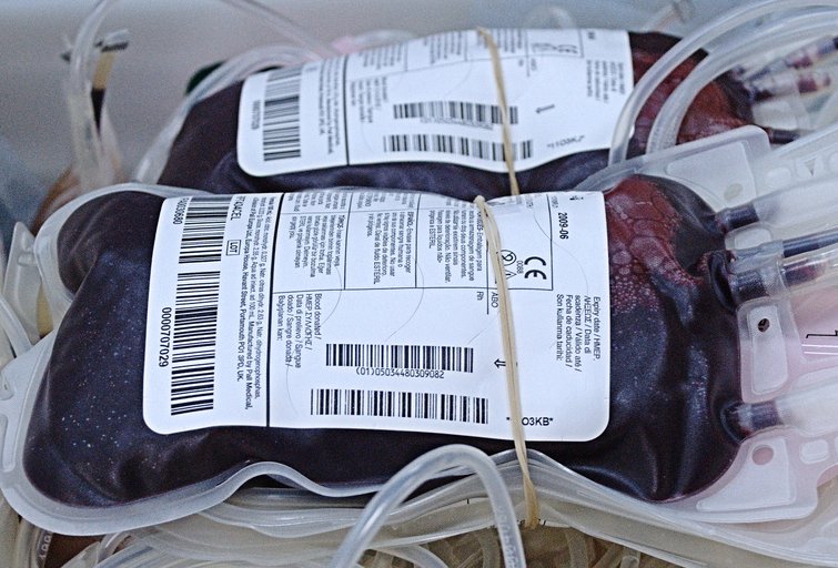
Blood and Hemoglobin:
Within our blood, the oxygen carrying protein, hemoglobin,
is largely responsible for the reddish color we see. The following photograph[2] shows human blood magnified 600 times.

In regions with larger amounts of blood present, the blood
will, of course, contribute toward shifting the appearance of the skin towards
red. Additionally, since this red is more chromatically intense than either the
color of melanin, or skin with an absence of blood or melanin, these blood rich
regions will have the highest chroma of any of our local skin colors—a
relationship that is well to keep in mind in order to produce the appearance of
naturalistic skin. It might also be speculated that since blood vessels are found
in the lower dermal layer of the skin, individuals with darker skin will not
show as pronounced of a local color shift when entering these blood regions
since the melanin causing the darker skin tones resides above the hemoglobin—somewhat
masking its appearance.

Variations:
The colors I have offered for blood, melanin, and skin
absent either, really suggest extremes. There will of course, be variations in
between them so that we may have to consider more than one to distinguish the
local color of a region. For instance, on lighter skinned individuals, the areas
that receive a fair amount of sun exposure will produce some melanin suggesting
that the region will be orangish-yellow. However, when hemoglobin is seen in
combination with the melanin, the hue's appearance will shift back toward red,
resulting in a local color that might be thought of as more truly orange in
character. The following chart shows the color of skin lacking both hemoglobin
and melanin in the lower left hand corner and the resulting color shifts as they
are both introduced. In theory, this chart should offer the full range of skin
colors found in any individual—including various local colors for a particular
individual that could be selected from within the array. Please keep in mind
that the colors selected for the chart were approximated.

Veins:
Although, like Wikipedia, most sources tend to suggest that
the bluish color is "because the subcutaneous fat absorbs low-frequency
light, permitting only the highly energetic blue wavelengths to penetrate
through to the dark vein and reflect back to the viewer,"[4] I am troubled by this explanation. For a
thought exercise, let's assume a model where an even spectrum of white light is
illuminating an arm with visible veins. Now, try to keep track of the various wavelengths
that are somewhat absorbed or reflected, as the light passes through the skin
(orangish-yellow), melanin (orangish-yellow), hemoglobin (red) and possibly even
the fat (yellowish color) before it then strikes the dark but still predominately
red vein, and then passes back up through all of these materials again. Keeping
in mind that the color of an object is the result of what is reflected rather
than absorbed, the resulting wavelengths available for the viewer to see after
this journey would seem to offer a predominance of wavelengths throughout the
red, orange and yellow spectrums rather than the blues the Wikipedia quote
seems to suggest.
To complicate things further, the same Wikipedia article
cites a study entitled Why do veins
appear blue? A new look at an old question. The summary of this study
states that "the reason for the bluish color of a vein is not greater
remission of blue light compared with red light; rather, it is the greater
decrease in the red remission above the vessel compared to its surroundings
than the corresponding effect in the blue. "[5] With an understanding that "remission,"
as it relates to how light interacts with materials, means "to send
back," the first part of this summary would seem in direct contrast to the
previous quote from the Wikipedia article and somewhat closer in line to the results
of the greatly simplified thought exercise I offered. As with the second part
of the study just quoted, some sources additionally cite visual perception as
playing a role in perceiving veins as blue.
To my understanding, visual perception seems to be a more
creditable account of what is occurring. Tied to "retinex theory," a
very low in chroma reddish-orange when seen surrounded by a field of the same
color can easily be judged as bluish or bluish green in color—even though in
actuality it is not. For this reason, I often suggest that a very very low in
chroma orange or reddish-orange (the color should be more exactly determined by
the local color of the region) that is slightly darker than the surrounding
local color will often serve just fine to suggest veins.
This effect is demonstrated in the two following images: The
first shows two larger squares. The left square is reddish-orange,
approximating a skin color, while the right square is chromatically neutral. The
smaller squares, contained in each of the larger squares, are the same color.
On the left the smaller square appears slightly bluish in color while on the
right you can more accurately see it is actually a very low chromatic
reddish-orange. With finer lines, rather than squares, the effect is even more
striking as is illustrated in the second image.


Part I Summary and
Future Posts:
Thus far we have been looking at what causes the various local
colors we see in human skin. I have yet to address how narrow the color range
for skin really is under average lighting conditions (although this may have already
been inferred by the discussion offered) or how the modeling factors for these
local colors influence any additional colors we might perceive. In future posts
I hope to address both. When addressing modeling factors I will discuss
highlights, a type of specular reflection, and how, when dealing with diffuse
reflection, the loss of light on a local color offers variations of value and
chroma of that local color. Additionally, I plan to address other considerations
such as reflected light (diffuse inter-reflection) and translucency (diffuse
transmission).
2. Image by John Alan Elson,
http://www.3dham.com/animal/bloodcompare.html
3. Image by "Flicker" user "montuno,"
http://www.flickr.com/photos/montuno/2285013430/
5. https://www.imt.liu.se/edu/courses/TBMT36/pdf/blue.pdf
Terrific post Doug!
ReplyDeleteAnother great great pedagogic work
Students and painters of the world, grateful for so deep insight!
This comment has been removed by the author.
ReplyDeleteWonderful explanations. You are a scientist of the ARTs. Each optical reference well dissected and described to perfection, brings light into the quest to find the most naturalistic skin colors.
ReplyDeleteThank you for the post, looking forward to the continuation.
Thank you for the depth of all you wonderful posts. I hope you you can make time for more. Looking forward to your next topic!
ReplyDeleteThank you everyone for the comments!
ReplyDeleteReally awesome article here Doug. I had a few "ah ha" moments while reading it. My mind is definitely stirring and I look foreword to future posts.
ReplyDeleteI have a couple of questions I hope you can answer I you can find the time.
The first is in regards to the "blue vein" mystery. Is perhaps, and I think this might be the Wikipedia explanation, the bluish effect similar to when you scumble a lighter color over a darker color a "cooler" or bluer hue is the result? Or, the lighter, translucent skin over the dark red blood filled vein creates a bluish local?
My other question is one that interests me very much. On my side of the country, the "warm cool" model sort or reins supreme. I've always had trouble with this model, and I understand it's much less scientific than what you are discussing. Almost invariably the new student, myself included, paints the shadows of a warm incandescent lit figure blue, purple or less frequently, green. This of course looks absurd, but I believe is a result of, at the very least, a misunderstanding of the warm-cool idea, if not a flaw in the idea altogether. The HUE of a shadow in a warm lit figure is almost always a lower chroma, lower value red orange or orange. in other words brown, a clearly "warm" color.
So my question is this; Is the "cooling" effect that many perceive as the form turns away from the warm light, really a result of the warm-cool principle, OR is it a result of the hue's value and and especially chroma lowering which gives the illusion of a cooler color?
And to play devils advocate to my own question, a dark blue or green can be added to the orange "flesh" hue to both lower it's chroma and lower it's value, so in terms of paint, you are "Cooling" it and making it more blue.
Hmmm. And now I'm chasing my tail. haha. Writing this makes me realize how difficult it is to put these concepts to words while staying clear and succinct. It makes your post even more impressive.
Hopefully there's a question worth answering in there somewhere. :) I've written way too much to not post it so here goes...
Really beautiful job of painting. Keep it up and don't forget to share your experience with us.
ReplyDeleteThank you for this valuable information, I hope it is okay that I bookmarked your website for further references.
ReplyDeleteGreat post, very interesting and fantastic explanation of skin colors, which I have been searching for answers to. Your explanation makes it very clear to me, and will definitely help my color problems in painting naturalistic skin colors. Thank you Doug! I can not wait to start another portrait right now! (and finish others I've not been happy with) I'm so glad I found your site Douglas Flynt !!
ReplyDeleteThanks,
Donna Passarelli
it is very nice vrej armenian
ReplyDeletemisrer Flynt are you painting
Deletewith dry brush?
Vrej Armenian from germany
Thank you everyone for the comments, I wanted to reply specifically to a few of them. I appreciate your feedback.
ReplyDeleteBen, I am glad you had some of those "ah ha" moments. They are why I like sharing information. I take delight in someone's else's excitement when they also gain new insights. To your first question, although I don't have the time at the moment to get into it too deeply, from my understanding the author's statement from the section of the Wikipedia article I cited is somewhat contradictory to the conclusion of the article they based their statements on. In essence, the article the statement is based on says that the veins do reflect predominately red wavelengths but less so than the surrounding areas. Quoting that article:
" To summarize, the reason for the bluish color of a vein is not greater remission of blue light compared
with red light; rather, it is the greater decrease in the red remission above the vessel compared to its surroundings than the corresponding effect in the blue."
The same article then goes on to say:
"Blue light does not penetrate as deeply into tissue as red light."
To my reasoning, if blue light may not actually penetrate as deep, being unable to reach the vein, to me this seems to be in conflict with the Wikipedia article when it states:
"Veins appear blue because the subcutaneous fat absorbs low-frequency light, permitting only the highly energetic blue wavelengths to penetrate through to the dark vein and reflect back to the viewer."
Moving to your second question, I also have problems with the "warm/ cool" model and when you say:
"Is the "cooling" effect that many perceive as the form turns away from the warm light, really a result of the warm-cool principle, OR is it a result of the hue's value and and especially chroma lowering which gives the illusion of a cooler color?"
The second section corrects states why we perceive a cooler color—nice job!
Finally to your statement:
"And to play devils advocate to my own question, a dark blue or green can be added to the orange "flesh" hue to both lower it's chroma and lower it's value, so in terms of paint, you are "Cooling" it and making it more blue."
I would say yes, you are correct again.
I love that the more we know the more logical color really is.
Dr Bajoshli, I am glad you are able to make use of my site as a reference. Thanks for the comment.
Vrej, I don't do much dry-brushing in my work. I hope that helps answer your question. Thanks for the comment.
Thanks again everyone.
Thank You Douglas! Very informative.
ReplyDeletehi. thank you for the post. i have a question. is it possible to use a dark complementary to darken a color or will it drop the chroma too much? adding a darker grey will "kill" the color less than the complementary?
ReplyDeleteThanks for the comment Guy and I'm glad we were able to connect via e-mail. I'll quote what I said in the e-mail in case it is useful for others:
Delete"I’m not really an advocate for using complementary colors for reducing chroma. Not only do I think it is easy to reduce the chroma too quickly for the value but it is very hard to get a perfect complement. Very often there will be some slight unintended hue shift as well. Adding black is usually not much better. It also generally reduces the chroma too quickly for the value. I can imagine some exceptions to this for objects that have a local color which is already very low in chroma. I wish this worked, pulling the color at a perfect diagonal toward the bottom center in color space, but most often it doesn’t. As I mentioned in the video thinking in terms of straight lines in color space for mixing colors is a good guess but is really only an approximation for what actually happens."
Yes i am totally agreed with this article and i just want say that this article is very nice and very informative article.I will make sure to be reading your blog more. You made a good point but I can't help but wonder, what about the other side? !!!!!!THANKS!!!!!! cheap 55 printing
ReplyDeleteExcellent post. Although I have to disagree with one part, which is the refutation of the scattered blue light theory from Wikipedia. You mention color constancy or the retinex system (the theory from Edwin H. Land) as the reason for this. Instead of saying it’s one or the other, I say it is both. That is because low chroma means an evening out of the tristimulus response where neutral simply means a balanced quantity of red, green and blue. The scattering of the blue wavelength and absorption of the red by definition will translate into a reduction of the red chroma. So, from a standpoint of reflectance and colorimetry, the percentage of blue is higher. Yes, red can still be the predominant color; so, from a Munsell notation both qualify as red; but, from a tristimulus perspective, both neutral gray and reddish gray are bluer than high chroma red; and the blue wavelength is measurable in the histogram signature of the area’s reflectance.
ReplyDelete