Sunday, October 19, 2014

3 New Workshops in 2015

I wanted to let everyone know I’ve got 3 new workshops added for 2015 that I’ll be teaching.

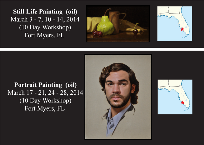
Two are back-to-back still life painting and portrait painting workshops in my hometown of Fort Myers, Florida during the month of March, both 10 days each so we can really get in lots of practice and cover lots of material.  It's some of the best weather here in Southwest Florida-sunny and warm, but not too hot!

If you can join me for one, great!  If you can get away long enough to come to both, spending the whole month, even better!  It's a relaxed environment but we still get serious about drawing, painting and oh yes...color!

Later in the summer, during August, I will be teaching a 5 day still life painting workshop in Austin, Texas. Even though it is only half the length of my other workshops, rest assured that I'm going to pack in as much information as I can!  The perfect opportunity for those who can't get away for my longer workshops.

If you want to learn more about any of these workshops please visit the teaching section of my website by clicking on the image below:  


If you can participate in one (or more) of the workshops I look forward to working with you! If you're not able to make one of these this time around hopefully there will be one in the future that will work better for you.  

Friday, June 27, 2014

Get More Confident With Color: Upcoming Evening “Light and Color” Session


Evening “Light and Color” Session
Grand Central Academy of Art, Monday, July 14, 2014.


Very often color is a mysterious area for many artists, leaving them questioning not only the colors they observe but also how to consistently mix up those colors!  I know early on I had these same concerns and it took me many years to gain a color framework that took these mysteries away.

During each of my workshops I offer a lecture/discussion centered on color – establishing a common framework for all the participants to make use of during the remainder of the workshop.

For my upcoming 6 day still life workshop at the Grand Central Academy of Art I will be giving this lecture/discussion on the first evening of the workshop.   And, for the first time ever, this session will be open to individuals beyond the workshop’s participants! Through a combination of images, props and often enthusiastic hand gestures I will be sharing information on:

-Color terminology.

-Organizing colors in a color-space model.

-Understanding fundamentals of how light works and affects our perceptions of an object’s local color and its shading.

 -Principles behind color mixing.

-How I go about designing a palette for a painting or a particular subject.

This approximately three-hour session will be packed with as much information as I can squeeze in — with time available for questions from the group.

If you can attend, I can’t wait to share with you the most critical ideas related to color that help me in each of my own paintings so that hopefully you can feel more confident in your own color decisions!

 (For more information (including how to register) for either the workshop or the evening lecture please click "HERE."


Monday, May 19, 2014

Cheating On My Cadmiums: Why I Replaced My Cadmium Paints


When I was an art student studying in New York City I dreaded having to purchase cadmium colors — as the proverbial starving artist I cringed at the price tag for them.  At that time any money was too much money.   But at some point I decided they were necessary and justified buying a cadmium red and a cadmium yellow light. I made do with just those two pigments for a number of years and they gave me that extra punch of chroma or intensity whenever I needed it. After awhile I found them a necessity for many projects.  At some point I ended up also adding cadmium orange to the mix. But still every time I went to repurchase them I found myself cringing at the price tag. However, by this point we had become old friends and despite the price I was so accustomed to their hue, value and chroma attributes that I automatically added them to my cart without much reservation whenever I needed a new tube.

A couple of months ago I started doing some tinkering with the colors on my palette and decided that I might look into some alternatives for my cadmium paints. And after trying a handful of different colors I finally settled on replacements for cadmium red and cadmium yellow light.  I thought I’d share those results in case there are others out there who also wanted to begin phasing out their cadmiums.

For cadmium red (PR108) I’ve replaced it with Scarlet Lake (PR255), also known as coral red or sometimes Pyrrole Scarlet.  From the reading I’ve encountered it appears to be quite lightfast receiving an “ASTM I rating.”  I like that although its hue is very similar to cadmium red light (which makes it feel familiar to me) its chroma is actually a bit higher and continues to hold up well with the addition of white paint — at least as well as the cadmium red I’ve been using.


For cadmium yellow pale/light (PY35) I have replaced it with Winsor yellow (PY74), also known as Hansa yellow, Arylide Yellow or Azo yellow. This one also receives an “ASTM I” rating which I’m pleased about. And although its hue appears to display slightly less of an orange trace, when compared to cadmium yellow light, it is still close enough in hue that it, again, feels familiar to me.  It also has a slightly higher chroma than cadmium yellow light, giving me just a touch more color-space range.


Now if the characteristics above were not enough to get me to make the switch, the price for them added that extra incentive I needed.  Both of these generally run under half the cost of their cadmium counterparts, and for the remnants of that starving artist I once knew so well, this makes me very happy!

Despite trying a few alternatives I’ve still yet to find a good replacement for cadmium orange — so I suppose it will still linger on my palette until I do so. If anybody has found a good replacement for it I would love to hear your suggestions.


Did you enjoy this post?

Join My E-mail List


Wednesday, January 8, 2014

A Quick Brushwork Tip for Artists and Two Great Books to Read


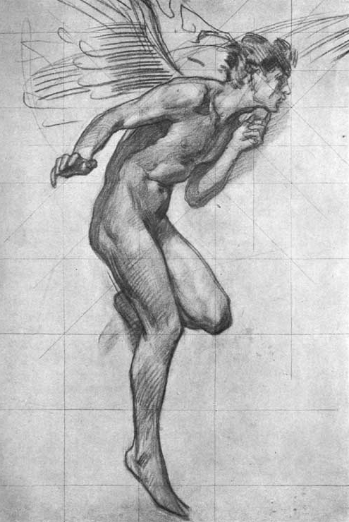
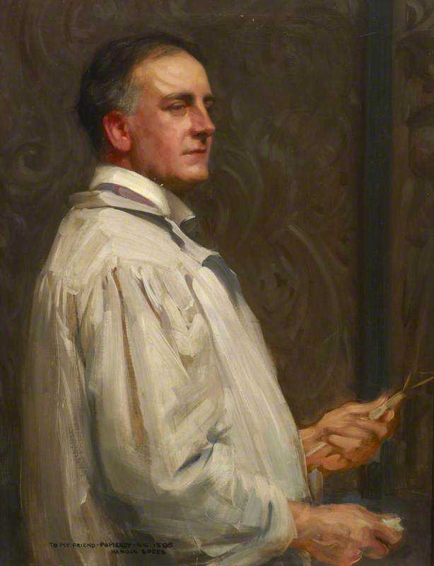
The images in the post are works by the artist Harold Speed (1872 -1957).  I've referenced him before in my post titled The Optical and Conceptual: Components of Perception.  You can read that post by clicking "here."

Study for figure of Boreas by Harold Speed


Much of the time while I am painting, brushstrokes are constantly cutting across one another. Yesterday while I was painting I recalled a statement by Harold Speed from his book Oil Painting Techniques and Materials.  In the passage I was recalling he was describing “painting such details as the under eyelid…” And made the point that “Generally speaking, remember that you can only attend to one edge of the touch that you are making.  If you try and paint a touch that needs variety on both its edges, and you try and get the variety on both sides at the same time, you will fail to get either right. ” In essence when we place a stroke of paint we can only focus on the exactness (drawing and placement) of one of its edges at a time. To get the other edge to be exactly as we wish we can then recut into it with the next stroke of paint.  This is such a simple and obvious thought and yet it can be tremendously helpful at times.

Frank Pomeroy, 1898 by Harold Speed


Within the classically-based art circles I’ve been most associated with, Harold Speed’s two books, The Practice and Science of Drawing and Oil Painting Techniques and Materials, are well-known and widely read. If you are a representational artist and you’re not familiar with his books I would highly recommend them. The Practice and Science of Drawing can be read online for free here:


or here:


Even though I don’t necessarily paint in the exact manner prescribed by Harold Speed, I find his books are full of insightful material—every time I go back to them I seem to pick out some new bit of information. If you’ve got any useful insights or tips you’ve gained from reading either one of his books I’d love to hear about them in the comments below!


Wednesday, December 11, 2013

A Paint Sketch and its Role During a Commission

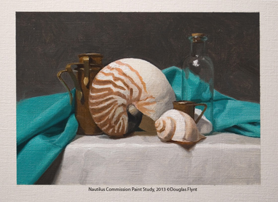
Recently I shared an image on Facebook.  I had originally intended to only post it there, but I was surprised by the amount of interest it received.  For this post I wanted to share that image which I believe may be interesting to both collectors and fellow artists alike.

The image below is small 5” x 7” paint sketch. Very often for commissioned work before I start the actual painting I will complete a sketch like this and present it to the client. Ideally, I prefer to present the actual sketch, rather than a photo of it, since a photo can appear quite different from monitor to monitor. Of course the commissioned painting will be considerably more detailed and carefully executed. However, a sketch like this gives a feel for the composition and colors I intend to use and I want to make sure the client is happy with the direction of the project before investing any significant time into the actual painting. With respect to this study, the client has already shared their approval and so I am moving forward!

I hope you enjoyed seeing the image and thanks for taking a look!


Friday, November 1, 2013

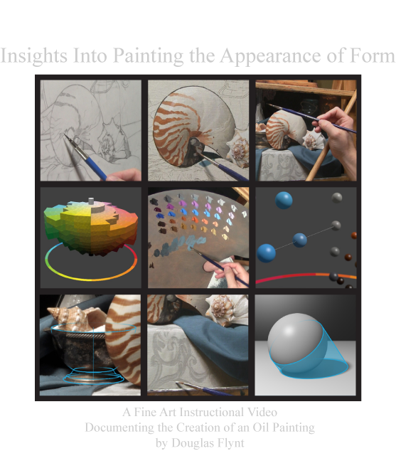
Painting a Still Life Video now Available & New 2014 Workshops


I have two items to share in this quick post.  My "Painting a Still Life" video is now available on my website for purchase as a download and I have added two workshops to my 2014 calendar!

For the video I worked hard to pack as much content as I could into its roughly 74 minute time frame. It documents the creation of one of my still life paintings—taking the viewer through each of the stages involved in the creation of the artwork. Along the way I share a number of insights about my thought process and the concepts I utilized while working.

If you would like to see more details about it please visit my website by using the following link:


You can also watch the preview below if you would like:


As for the workshops, they will be held back to back—so that you might attend both if you would like. 

For more information please click "Here" 


Thanks for taking a look!

Tuesday, October 15, 2013

"Painting a Still Life" Video Preview


I am pleased to share a preview for my upcoming instructional video first announced a few weeks ago. 

With the final edits being made, I can now share that it will be available for purchase as a download from my website on October 28, 2013:

I hope you enjoy the preview!


Saturday, September 28, 2013

Still Life Painting Instructional Video


I am pleased to share that I have a new instructional video in the works. I have had numerous requests for instructional videos and this will be my first release. I am hoping it will offer insight into not only my current painting process but also a number of the ideas I consider during the creation of an oil painting. Over an hour in length, it will be available as an instant downloadable video. The exact release date along with other details are still to be announced. If you would like to receive updates, including a notification when the video is available, please consider joining my e-mail list by visiting the link below:

Join Douglas Flynt's Mailing List

The painting featured in the video is currently available through Scottsdale Fine Art:

7116 E. Main Street
Scottsdale, AZ 85251


Sunday, November 25, 2012

Newly Available Paintings


For this post I wanted to share a few newly available paintings.  The John Pence Gallery in San Francisco will be looking to find homes for them.

If you have an interest in acquiring one (or more) of these pieces for your own collection please contact the gallery:

John Pence Gallery
750 Post Street . San Francisco . California 94109
Phone: 415.441.1138 | Fax: 415.441.1178
Hours: 10 am to 6 pm (Mon - Fri), 10 am to 5 pm (Sat)

If you are in the area and would like to see them in person please stop by the gallery.

Below you will find images of each piece, with and without their frames, along with pertinent size and medium information.

Regardless if you are, or are not, looking to acquire a new painting for yourself (or someone else) at this time I hope everyone will enjoy seeing these new works!

Thanks for stopping by!


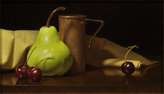
Pear and Cherries
Oil on Mounted Linen
6" x 10"


Two Tigers
Oil on Stretched Linen
10" x 14"


Sand and Shells
Oil on Stretched Linen
10" x 14"


Monday, June 11, 2012

Painting Naturalistic Skin Colors (Part I—Regional Local Colors):


 When teaching workshops related to portraiture or figure painting, I often encounter artists who feel somewhat mystified by the colors they see in skin. From a naturalistic standpoint skin follows all the rules of physics that any other material does. So like any other material, once we have a better understanding of skin, we can begin to demystify the colors we see.

I generally encourage the artists I work with to think in terms of identifying a local color specific to the region of form(s) they are currently painting. This local color can then help guide their color choices rather than their reacting moment-by-moment to the colors they feel they see. From a somewhat simplified standpoint I would encourage painters to consider three main variables when accounting for the local color of a given region: (1) the amount of blood present, (2)the amount of pigmentation, and (3) the color of the skin itself (devoid of or with low amounts of blood or pigmentation). There are, of course, variations between these as we visually detect more or less of each. 

In this post I will try to expand upon these variables in order to help explain what local colors are really present in skin and why. In subsequent posts I would like to discuss how narrow the color range of skin really is under average lighting conditions, and also how a regional local color, when combined with various modeling factors, gives us the full range of the colors we experience visually when looking at flesh tones.

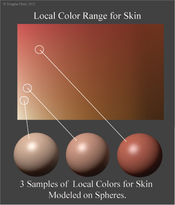
The following diagram shows a range of local skin colors in addition to spheres illustrating the modeling factors seen for 3 different local colors selected from this gamut.


The Local Color of Skin Absent Blood or Pigmentation:

I want to start with a discussion of skin imagined with an absence of blood or visible pigmentation. This concept of skin as a "local color" stands as the blank canvas for every individual—regardless of ethnic background. To this we can add factors of blood and pigmentation. Of course in reality this "local color" in its most ideal state is perhaps impossible to fully experience. Even in cases of albino individuals (illustrated in the following images from Wikipedia[1]), who lack any pigmentation, the blood in the skin will affect the color we see. 

 
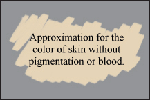
However, in order to obtain a sense of the skin color to which I am referring, first locate a place on your body that has little visible pigmentation—perhaps the palm of the hand, or some other area that receives little sun exposure. This will, of course, be easier for lighter skinned individuals. On this area apply a generous amount of pressure to displace the blood from the region and then remove the pressure. For a brief moment, before the blood returns, the color you observe will begin to offer a sense of the local color we are conceiving of at it's most extreme state. Trying to classify this color can be a bit tricky. Most scientific accounts of which I am aware typically only say that skin by itself is yellowish in color. I would narrow this down more by adding—from my own experience—that skin by itself is rather light in value and more orangish-yellow rather than the yellow it is often described as. By itself, it also generally offers the lowest chromatic intensity of any local color observed in skin.

 
Melanin as a Pigment:

Within the epidermal, or upper layer of our skin, we find melanocytes or cells that produce melanin. This melanin is responsible for helping to protect us from the sun's ultraviolet rays. Although everyone, regardless of ethnicity, has approximately the same number of  melanocytes, the production rate, size, and type of melanin pigment they create, is what offers the visual color differences between various individuals.  
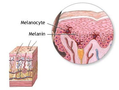
 
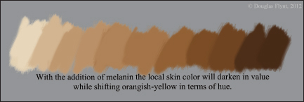
The two types of melanin produced are pheonmelanin which is often described as light yellow, tan or even reddish yellow and eumelanin which is alternatively described as dark brown or even black. After reviewing a number of descriptions and various charts showing the wavelengths both types absorb, it would appear that they show more of a marked difference in terms of value rather than hue. The result is that, in general, the addition of melanin of either type contributes toward skin darkening in value while shifting its hue toward an orangish-yellow. To get a better sense of the color they contribute try looking at moles and freckles. These can offer some sense of their color since their appearance is brought on by an increased amount of melanin.
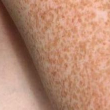
 
For each individual this melanin production will affect the overall skin color. Additionally, within a particular individual, areas that get more sun exposure will produce more melanin. The result is that these areas will be darker in value than the paler skin regions with little visible blood or melanin.  


Blood and Hemoglobin:

Within our blood, the oxygen carrying protein, hemoglobin, is largely responsible for the reddish color we see. The following photograph[2] shows human blood magnified 600 times. 

 
In regions with larger amounts of blood present, the blood will, of course, contribute toward shifting the appearance of the skin towards red. Additionally, since this red is more chromatically intense than either the color of melanin, or skin with an absence of blood or melanin, these blood rich regions will have the highest chroma of any of our local skin colors—a relationship that is well to keep in mind in order to produce the appearance of naturalistic skin. It might also be speculated that since blood vessels are found in the lower dermal layer of the skin, individuals with darker skin will not show as pronounced of a local color shift when entering these blood regions since the melanin causing the darker skin tones resides above the hemoglobin—somewhat masking its appearance.  


Variations:    

The colors I have offered for blood, melanin, and skin absent either, really suggest extremes. There will of course, be variations in between them so that we may have to consider more than one to distinguish the local color of a region. For instance, on lighter skinned individuals, the areas that receive a fair amount of sun exposure will produce some melanin suggesting that the region will be orangish-yellow. However, when hemoglobin is seen in combination with the melanin, the hue's appearance will shift back toward red, resulting in a local color that might be thought of as more truly orange in character. The following chart shows the color of skin lacking both hemoglobin and melanin in the lower left hand corner and the resulting color shifts as they are both introduced. In theory, this chart should offer the full range of skin colors found in any individual—including various local colors for a particular individual that could be selected from within the array. Please keep in mind that the colors selected for the chart were approximated.


Veins:

Although I did not mention veins in my introduction, what color to use for them is often a concern that arises when discussing skin colors and so I thought I should address it. Contrary to what is commonly assumed, veins are not actually blue in color. These blood vessels that generally carry deoxygenated blood back to the heart are actually very dark red in color with some suggestions that along with this darkening of value the red appears more purplish. The following image[3] shows venous blood—offering some sense of it's color. 
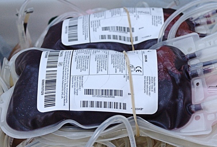
 
Although, like Wikipedia, most sources tend to suggest that the bluish color is "because the subcutaneous fat absorbs low-frequency light, permitting only the highly energetic blue wavelengths to penetrate through to the dark vein and reflect back to the viewer,"[4] I am troubled by this explanation. For a thought exercise, let's assume a model where an even spectrum of white light is illuminating an arm with visible veins. Now, try to keep track of the various wavelengths that are somewhat absorbed or reflected, as the light passes through the skin (orangish-yellow), melanin (orangish-yellow), hemoglobin (red) and possibly even the fat (yellowish color) before it then strikes the dark but still predominately red vein, and then passes back up through all of these materials again. Keeping in mind that the color of an object is the result of what is reflected rather than absorbed, the resulting wavelengths available for the viewer to see after this journey would seem to offer a predominance of wavelengths throughout the red, orange and yellow spectrums rather than the blues the Wikipedia quote seems to suggest.

To complicate things further, the same Wikipedia article cites a study entitled Why do veins appear blue? A new look at an old question. The summary of this study states that "the reason for the bluish color of a vein is not greater remission of blue light compared with red light; rather, it is the greater decrease in the red remission above the vessel compared to its surroundings than the corresponding effect in the blue. "[5] With an understanding that "remission," as it relates to how light interacts with materials, means "to send back," the first part of this summary would seem in direct contrast to the previous quote from the Wikipedia article and somewhat closer in line to the results of the greatly simplified thought exercise I offered. As with the second part of the study just quoted, some sources additionally cite visual perception as playing a role in perceiving veins as blue.

To my understanding, visual perception seems to be a more creditable account of what is occurring. Tied to "retinex theory," a very low in chroma reddish-orange when seen surrounded by a field of the same color can easily be judged as bluish or bluish green in color—even though in actuality it is not. For this reason, I often suggest that a very very low in chroma orange or reddish-orange (the color should be more exactly determined by the local color of the region) that is slightly darker than the surrounding local color will often serve just fine to suggest veins.

This effect is demonstrated in the two following images: The first shows two larger squares. The left square is reddish-orange, approximating a skin color, while the right square is chromatically neutral. The smaller squares, contained in each of the larger squares, are the same color. On the left the smaller square appears slightly bluish in color while on the right you can more accurately see it is actually a very low chromatic reddish-orange. With finer lines, rather than squares, the effect is even more striking as is illustrated in the second image.


Part I Summary and Future Posts:

Thus far we have been looking at what causes the various local colors we see in human skin. I have yet to address how narrow the color range for skin really is under average lighting conditions (although this may have already been inferred by the discussion offered) or how the modeling factors for these local colors influence any additional colors we might perceive. In future posts I hope to address both. When addressing modeling factors I will discuss highlights, a type of specular reflection, and how, when dealing with diffuse reflection, the loss of light on a local color offers variations of value and chroma of that local color. Additionally, I plan to address other considerations such as reflected light (diffuse inter-reflection) and translucency (diffuse transmission).  


2.  Image by John Alan Elson, http://www.3dham.com/animal/bloodcompare.html
3.  Image by "Flicker" user "montuno," http://www.flickr.com/photos/montuno/2285013430/

Thursday, October 27, 2011

More French Translations for Earlier Posts

I wanted to again thank Franck SATAUD for the additional French translations.

They are available below as downloadable PDF files:

using_a_sphere_french_translation.pdf


Thursday, October 13, 2011

2012 Florida Workshops

I am pleased to announce that I will again be hosting two 10 day workshops in the Fort Myers, Florida area. The workshop will be held at my previous studio location (some of you may know that I have set up a new home studio) that is close to Sanibel Island and Fort Myers Beach.

The first will be focusing on still life painting while the second will focus on portrait painting. My goal is to sharing a wealth of information in the form of demonstrations, group lectures/discussions and individual feedback sessions, all while striving for an intimate and relaxed atmosphere.

I look forward to working with everyone who can attend!


"Still Life Painting in Oil" 10-Day Workshop
Date: March 12 - 16, 19 - 23, 2012
Location: Fort Myers, FL
Click "here" for further information regarding enrollment.


"Portrait Painting in Oil" 10 Day Workshop
Date: April 16 - 25, 23 - 27, 2012
Location: Fort Myers, FL
Click "here" for further information regarding enrollment.


Tuesday, October 11, 2011

French Translations for Posts on Ellipses

I wanted to make a quick post extending my thanks to Frank SATAUD who voluntarily translated my last two posts on ellipses into French and then offered to share those translations for French readers of the blog.

They are available below as downloadable PDF files.

Accurate Ellipses- Part 1

Expanding on Accurate Ellipses - Part 2

Monday, September 26, 2011

Expanding on Accurate Ellipses

(UPDATE 10/11/11 -For French translation of this post please click "here.")

For this post I wanted to expand on my previous post that addressed drawing ellipses—an element so critical to my own paintings.  In the previous post I illustrated the “major” and “minor” axes of an ellipse, showed that an ellipse or circle in perspective could be constructed at the picture plane, and offered a geometrical construct to aid us in drawing ellipses regardless if they are 2-dimensional (at the picture plane) or in perspective.  If the reader is unfamiliar with those items reading the previous post might prove useful before going further.  Here is a link to the previous post:


After drawing or painting a great number of still-life elements it becomes evident that the placement and orientation of the major and minor axes are critical to constructing an accurate ellipse within a drawing or painting.  In my own work I largely free hand the drawing rather than setting up a careful perspective framework and then make use of my perspective knowledge to inform and correct the decisions I make. 

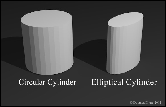
Before going further I should clarify that the following discussion addresses circular, cylindrically shaped objects (cylinders with cross sections that form perfect circles) rather than forms derived from elliptical cylinders, also know as “cylindroids,” whose cross sections are elliptical.  It should also hold true for right angle cones that have circular cross sections. 


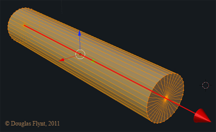
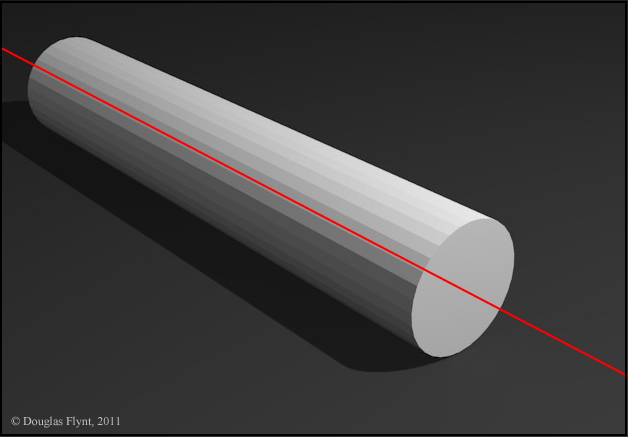
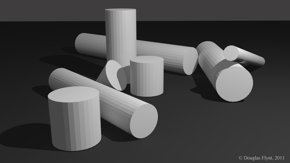
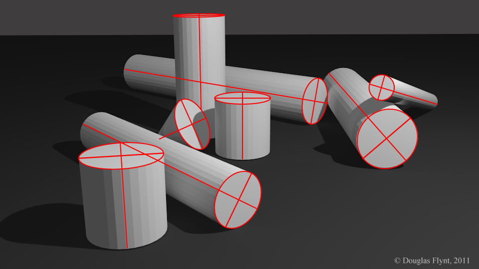
When perceiving an ellipse that belongs to these types of objects, we need to find the orientation of the minor axis for that ellipse.  Knowing this will in turn let us find the major axis of the same ellipse.  One way to find the minor axis of one of these ellipses is to first find the center axis of the object—that is the axis running through the object perpendicular to its ends.  The following image shows this axis for a simple cylinder.


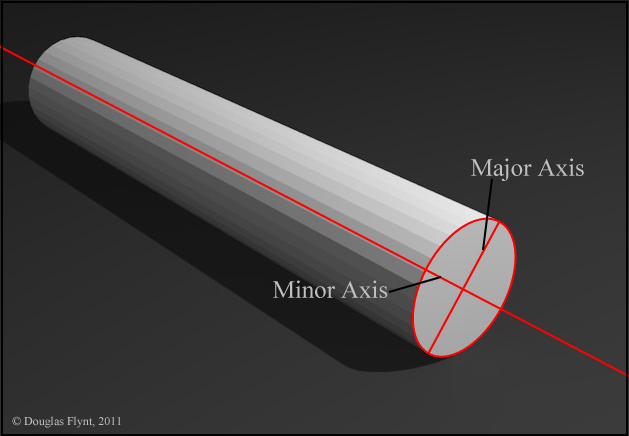
Once we know this center axis spatially we need to visualize the angle or line that we would perceive at the picture plane for this axis.  This will also be the visual line of symmetry for the outside contour or silhouette of the object.    


Working 2-dimensionally at the picture plane, this line will run through the minor axis of any ellipses we might need to draw for that object.  We then know that the major axis will run perpendicular to the line we found.  Now that we know the orientation of both axes, once we visually determine their lengths we can construct a perfect ellipse for any of the circles that we see in perspective!


This all might seem rather self evident for a glass of water sitting upright directly in front of you but as you encounter cylindrically based objects that are spatially rotated to more unconventional positions guessing the orientation of the major and minor axes can at times become rather tricky and I have found that this simple understanding and assessment greatly aids me in my own work.  Here are some cylinders (and a cone) to illustrate a few more examples:


Thanks for taking a look!


Monday, August 8, 2011

Accurate Ellipses

(UPDATE 10/11/11 -For French translation of this post please click "here.") 

I finished up teaching a still life workshop at the Grand Central Academy of Art about a week ago.  While there one of the items we discussed were drawing accurate ellipses in our still-lifes.  I thought I would share some of that information here.  This information has been of great use to me while drawing cylindrically based objects such as cups and jars in my own still-lifes 

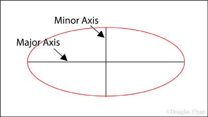
One of the first things we need to know is some terminology pertaining to ellipses.  The widest distance across an ellipse is known as the "major axis" while the shortest distance is known as the "minor axis."  For a circle the major axis and the minor axis would be the same distance.


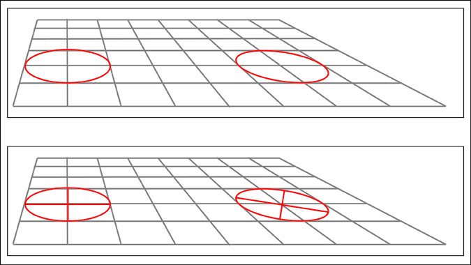
With this shared terminology, it is interesting to note that if we take an ellipse and place it in perspective the resulting curvature we perceive is no different than if we were to construct an ellipse at the "picture plane" using the dimensions of the major and minor axes as they appear at this picture plane.  The image below shows a circle in perspective on the left and the resulting ellipse that we would see at the picture plane on the right. The curvature of both are the same. 


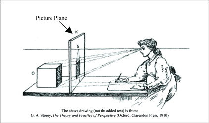
As a quick side note, for those of you unfamiliar with the term picture plane, in perspective it is the imaginary flat surface that is located between the viewer and the object being viewed.  The drawing below from G.A. Storey's 1910 book, The Theory and Practice of Perspective gives a good visualization for imagining a picture plane.


Returning to our ellipses, because the ellipse found in perspective and the ellipse constructed at the picture plane both create the same curvature we don't actually have to construct the circles or ellipses we see within our still-lifes in perspective—it should however be noted that the ability to do so is a valuable aid to our conceptual comprehension.  Instead, and here is the important part, to draw a ellipse or circle being viewed in perspective we only need to know the dimensions of the major and minor axes as they are perceived at the picture plane.  With these dimensions we can correctly construct an ellipse at the picture plane which will correspond to the ellipse or circle being viewed in perspective.

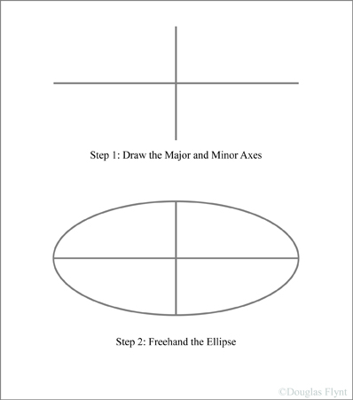
With this knowledge in tow, for now let us only work at the picture plane and construct an ellipse.  There are many ways to construct ellipses yet there are two main ways that I usually find myself constructing them (or very often correcting freehanded versions of them).  If they are rather small I often just draw the major and minor axes in and then carefully freehand the ellipse checking the symmetry of both sides as I go.    

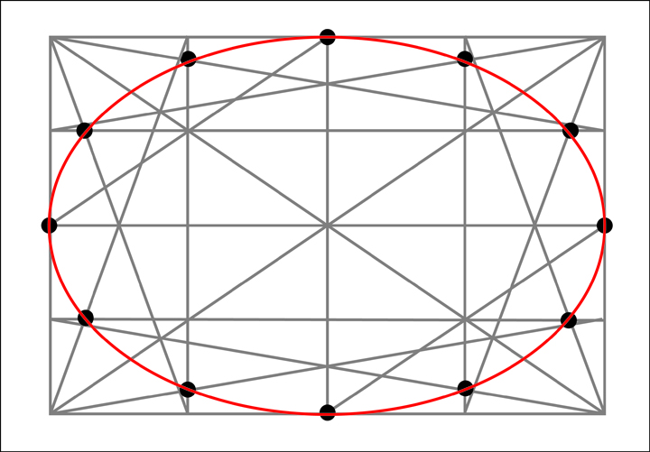
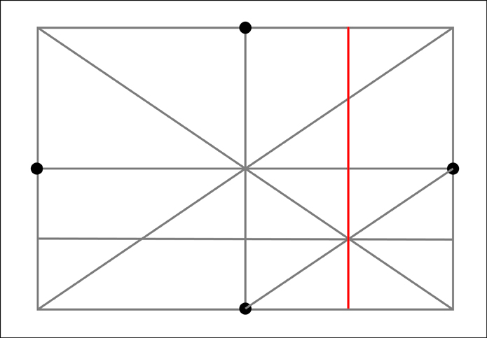
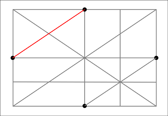
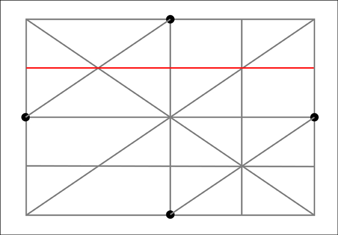
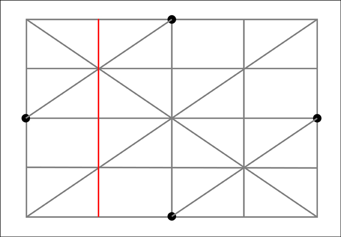
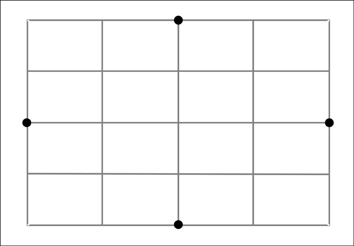
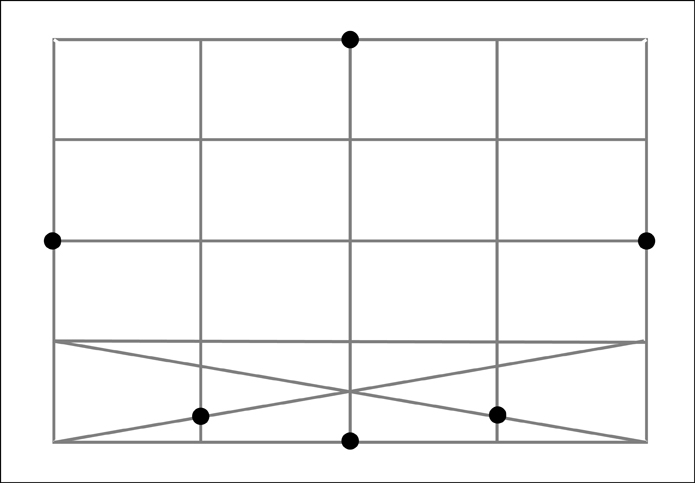
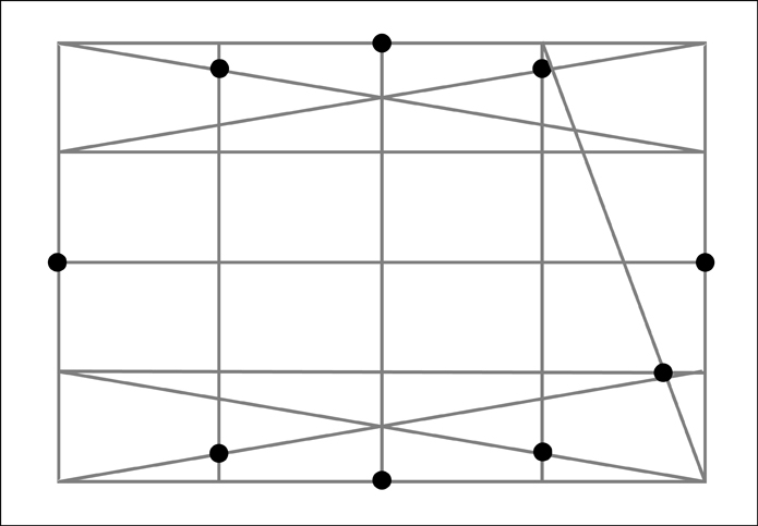
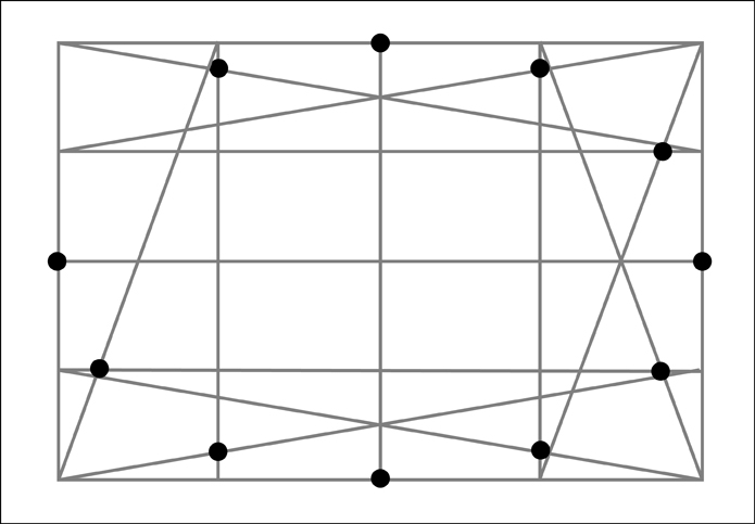
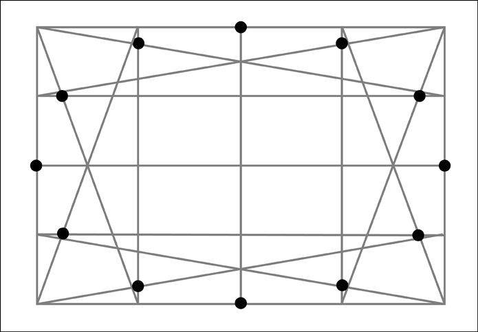
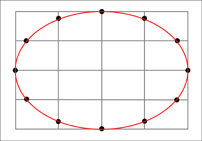
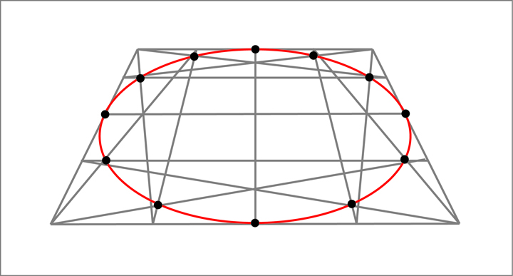
For larger ellipses I construct the following geometrical frame work which gives me 12 points along the ellipse to guide any freehanded approximations.  

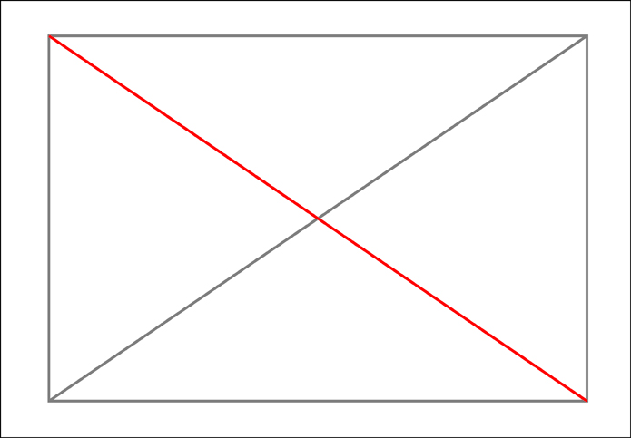
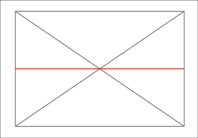
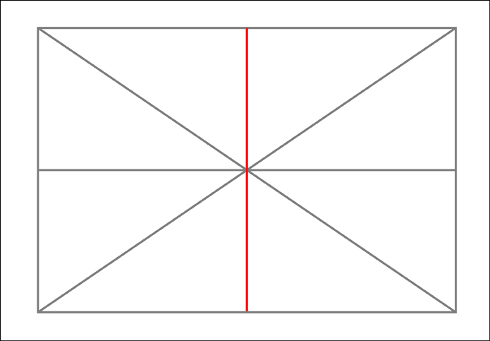
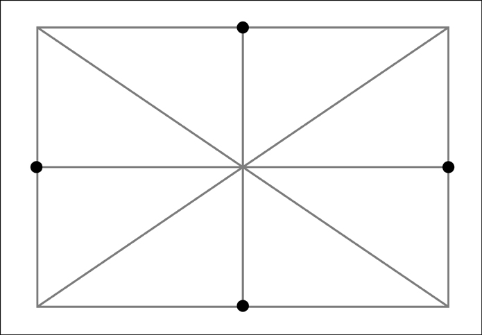
To make the framework I need to first create a rectangle with the proportions of the major and minor axes of the ellipse.  I then need to divide this rectangle into 16 equal sections.  To make these sections it is useful to remember that a simple “X” created from diagonal corners of the rectangle will always find the center of that rectangle.  Along the way we will also gain 4 of our 12 points that make up the ellipse.


At this point we now know 4 of our points and we have divided our rectangle into 4 equal sections.  We now need to divide each of those sections into four more sections.


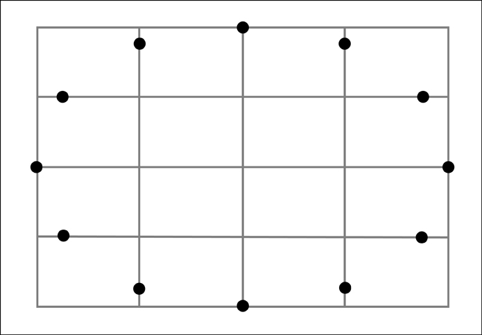
We now have 16 equal sections.  However, before going further let's remove the diagonals used in constructing those sections to keep things from getting too visually confusing.


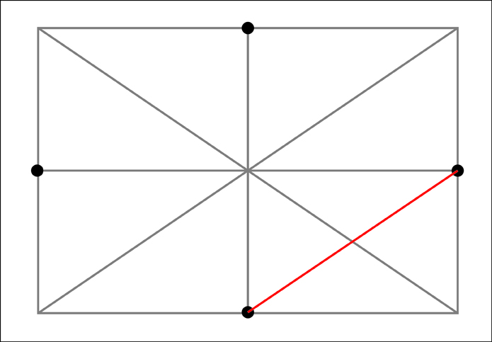
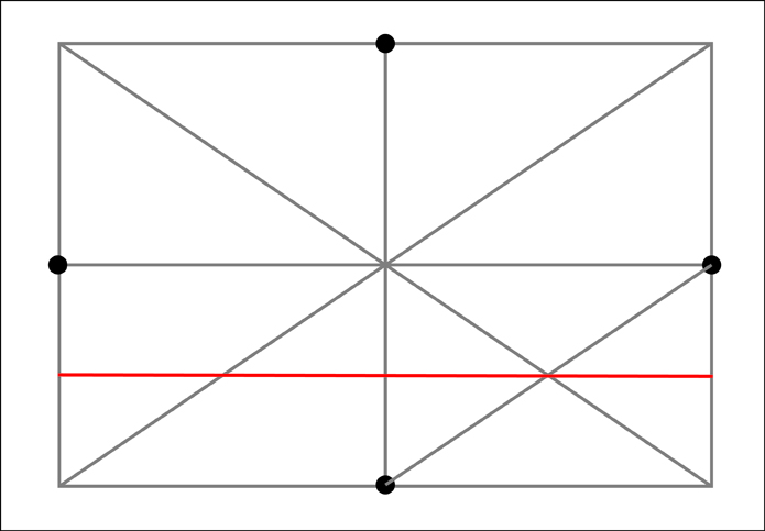
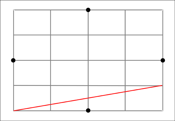
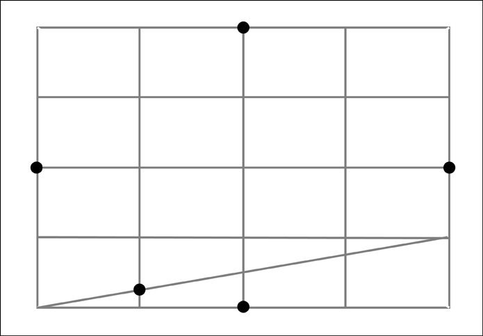
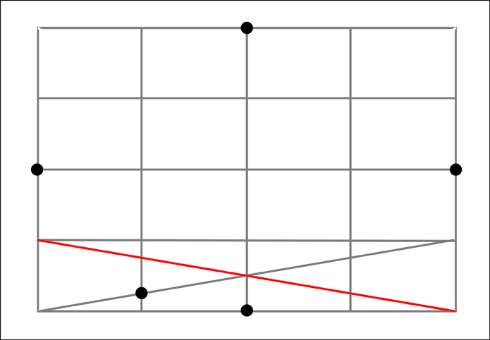
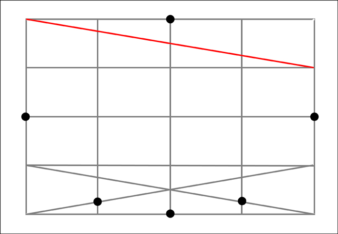
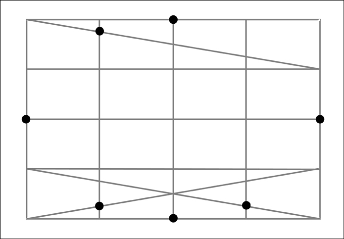
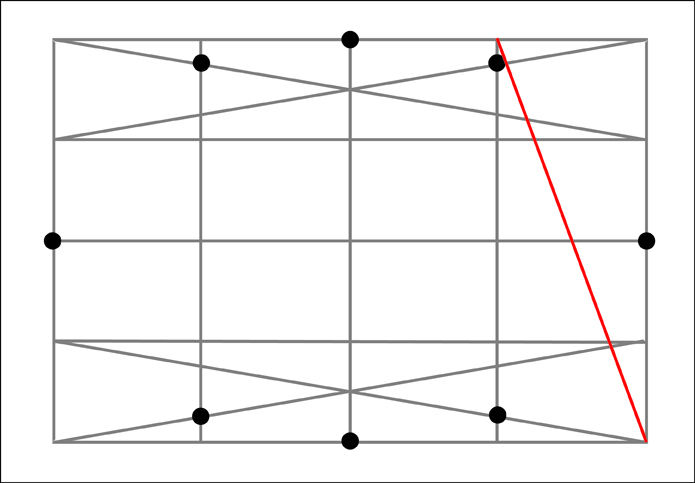
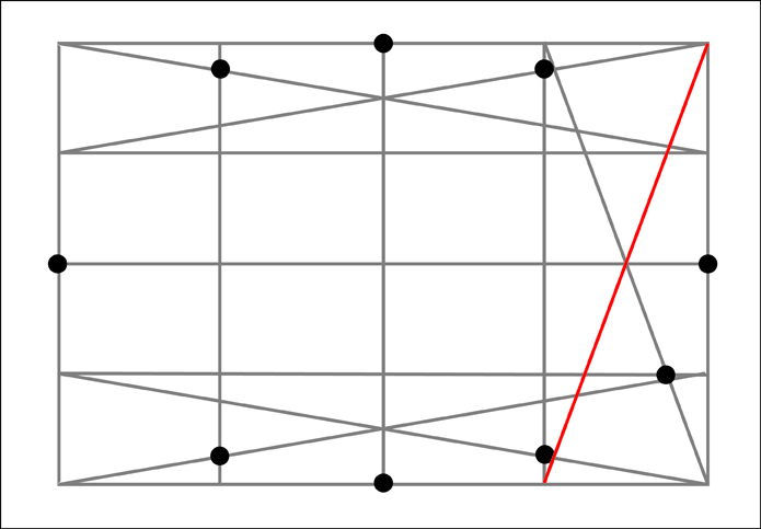
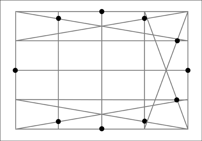
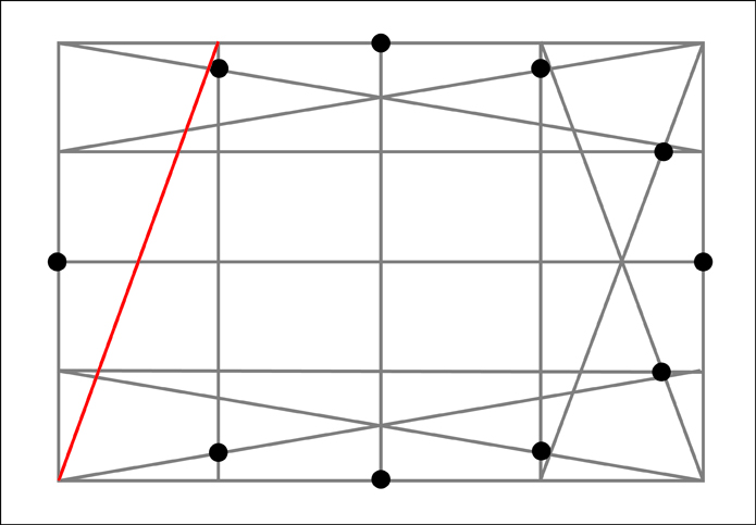
To find the remaining 8 additional points we need to run diagonal lines across the 4 outer sections along each side. Next note where these diagonals intersect the boundaries between the outer four sections of that particular side.  At these intersections, the one that is the closest to the outside of our original rectangle will also mark a point along our ellipse.  Let's start with the bottom section.


Now for the top section.


The right section.


And finally the left section.


Once again, for clarity let's remove the diagonals used to find the additional points.


And finally we now have 12 points we can use to aid us in drawing our ellipse!


Leaving the picture plane behind, it is useful to know that this same process works just as well to draw ellipses or circles that are in perspective.


This knowledge has been a resource which I have found very useful in my drawings and paintings.  After a couple of times rehearsing the process it becomes fairly easy to commit to memory.  Additionally, after constructing a number of ellipses in this formal and structured way I suspect that most people will begin to get more accurate results when free-handing them without such a complex framework. 

Going even further, some of you may have already picked up on the fact that the ellipses I have shown in perspective have thus far been in one point perspective with an ellipse that would be directly in front of us (the viewer).   It is interesting to note what happens when the ellipse is moved left or right from this center position. In doing so the major and minor axes of the ellipse (as seen at the picture plane) will begin to rotate.  They do however continue to stay perpendicular to one another.   


There is still plenty more to share on this subject however my busy schedule means that I will have to return to the subject at another time.  Yet I hope some of you will benefit from what I have been able to share.  And as always, thanks for visiting.

Did you enjoy this post?

Join My E-mail List