Sunday, July 25, 2010

The Composition of Light and J. G. Vibert

(UPDATE 10/27/11 -For French translation of this post please click "here.")
I was recently reading "The Science of Painting" by J. G. Vibert and came across a section where he discusses understanding the local color of an object in terms of the color spectrum of light and which wavelengths are absorbed vs. reflected. Here is a brief excerpt:

"If, on the contrary, a body sends back a part of the light received, and decomposes the rest, the colour of the coloured ray or of the mixture of coloured rays which it will send back will be of a colour more or less light, according to the quantity of light sent back.

Example: —A body which sends back the half of the light received, decomposing the remainder, and sending back only the red ray, gives the impression of half-white and a seventh of half-red, i.e. pink."
J. G. Vibert, The Science of Painting, trans. (from 8th edition) and ed. J. G. Vibert (London: Percy Young, 1892), 22
Online text of book:
http://books.google.com/books?id=LO8DAAAAYAAJ&printsec=frontcover&dq=The+science+of+painting+vibert&source=bl&ots=VGmKXHT7wr&sig=D__AAeHVIyvRXcOwfiA4uYgFh14&hl=en&ei=IjdMTIGxOoS8lQeNwMj4DQ&sa=X&oi=book_result&ct=result&resnum=1&ved=0CBcQ6AEwAA#v=onepage&q&f=false

Images of J. G. Vibert's work:
http://www.artrenewal.org/pages/artist.php?artistid=134
I found the text interesting because I sometimes think of a model which examines the light wavelengths present to keep track of the appearance of an object's color (in terms of hue, value and chroma). I make use of this model both in my own work and also in my teaching and thought I might share some of that information here.

I should point out that this model is not entirely truthful when dealing with the resulting color we perceive based upon the composition of light. I will endeavor to clarify this problem later in the post. Despite this flaw, as a model, it consistently works to keep track of how the color of an object appears to change based on the light it receives and then reflects.

As I have discussed in previous posts, light is composed of many different wavelengths and for our model I am going to classify them into 6 groups, namely red, orange, yellow, green, blue, and violet


(Note: This is different from Vibert who uses 7 colors—perhaps influenced by the writings of Newton.)
Newton's Color Wheel
To visualize the model I think of the colors in the form of a bar graph. All of the bars together add up to 100%. However, each bar individually only contributes about 16.7%. If all colors of light are present in a very high degree this translates to appearing very light in value. In this same scenario because all wavelengths are present they will neutralize one another giving the appearance of a neutral (achromatic) color. In this situation the resulting color would appear white.


(Note: The percentages of light in the diagrams and the resulting color are highly approximated. They are mainly for offering a rough visualization of the concept being discussed)

The absence of light would of course appear as black.


With less overall light present but all colors in equal proportion the result would still be chromatically neutral but darker in value—giving the appearance of a grey.


Along these lines and speaking in terms of the appearance of objects as composed from their reflected light, rather than the light source itself, Vibert offers the following:

"A body which absorbs part of the light and sends back the rest is grey. The whitest objects, therefore, are only very light grey, and the blackest very dark grey. However, the light which a grey body sends back is the same as that which is sent back by a white body: the difference is merely in quantity."
J. G. Vibert, The Science of Painting, trans. (from 8th edition) and ed. J. G. Vibert (London: Percy Young, 1892), 21
Continuing with the model being presented, if only one color is present the result will be that hue. Because there are no other colors present this color will be at its highest chromatic intensity. However since there is less light present overall it will have darkened in value.


As there is less light of this particular color present it will continue to darken in value and appear to weaken in chroma.


If one color is present in it's full percentage but we add back in the other colors in equal proportion this increase in the amount of light will cause the value to lighten but the chroma to weaken.


In looking at the model it may be useful to imagine the percentage of all colors equally present as equaling that percentage of white, the absence of light as equaling that percentage of black, and the percentage of color(s) present individually (not already included with our white percentage) as equaling the percentage of that color. By then combining these together we get some sense of what the resulting color might be. The following diagram should make this easier to grasp.


It needs to be mentioned that this model of light as it has been presented so far is based on the composition, or mixture, of wavelengths an object would reflect assuming full illumination. With less illumination, such as is found upon planes of an object "turning" from a light source, this "mixture" would be the same, but there would be less of the "mixture" overall. The result would cause the appearance of the local color's mixture to darken in value and weaken in chroma.


I mentioned earlier that there is an untruth with this model. This untruth lies in the fact that our perceptions of colors are due to combinations of various wavelengths so that just because we see a color does not mean that those light waves are actually present. A great example is that the screen you are viewing is composed of only 3 colors of light which are red, green and blue. Despite this you have experienced the color of orange in the diagrams I offered. However for our purposes the model will yield consistent perceptual results in trying to understand the relative changes to the appearance of objects when observing the loss or addition of certain assumed wavelengths—for instance when dealing with reflected light since the reflected light will have a different composition of wavelengths than the original light source.

There are many ways we can use this model to help explain what we see but they are more than I can post at this time. Perhaps in a future post I can use the model to explain particular examples—for instance how the reflected light from an object reflecting back onto itself can cause the object to appear even higher in chroma, even when there is less light present such as in a shadow.

Thanks for taking a look.

Wednesday, June 30, 2010

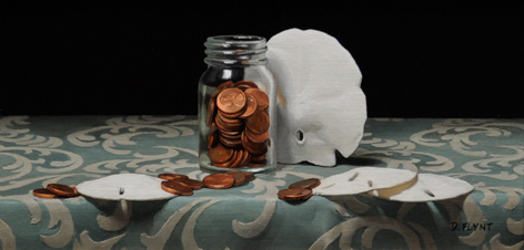
"Dollars and Cents"

For this post I thought I would share a recently finished painting entitled "Dollars and Cents." It is a small piece at only 6" x 12" and was painted in oil on a mounted linen panel.


This particular piece is currently in transit to Nantucket, MA where it will be available for purchase from Cavalier Galleries.

You can visit their website by clicking on the following link:
http://www.cavaliergalleries.com/html/home.asp

Thanks for taking a look.

Wednesday, June 16, 2010

Update on the Link between Value and Chroma

(Update 1/18/12) For a French translation of this post please click here for a downloadable PDF file:

After my last post I had an e-mail exchange with Dr. David Briggs (who I had referenced in the post). He had some further information to share regarding the subject I was writing about along with some accompanying images. The information he shared concerns the anticipated trajectory through color space that occurs with a loss of light—particularly a distinction between computer color space models such as HSB or HSL and Munsell Color Space.”

HSB, HSL: http://en.wikipedia.org/wiki/HSL_and_HSV

Munsell Color Space: http://en.wikipedia.org/wiki/Munsell_color_system

In light of this new information I wanted to share his comments and images.  You will find the images directly below his text.


Dr. Briggs said:

"These lines we are drawing represent the set of points where, as brightness varies, the balance of wavelengths remains the same. Technically, these are called lines of uniform "chromaticity". As I've said on Dimensions of Colour, these lines maintain uniform HSB "hue" (H) and "saturation" (S), and appear in YCbCr space (the space I used for many of my illustrations) as perfectly straight lines radiating from the point of zero light energy.


More recently I've been looking into how these lines appear in Munsell space. The Munsell chroma scale fundamentally has a visual basis, and there is no in-built theoretical relationship between chroma and saturation. Nevertheless Ralph Evans reported that when projected onto a hue plane, paths of uniform chromaticity (and therefore uniform saturation) delineate simple straight-line relationships between lightness and chroma (Fig. 1, from Evans, The Perception of Colour, 1974). Surprisingly at first, however, these lines radiate from a point roughly one and a half Munsell value divisions below the Munsell zero value. I believe that this is because the Munsell zero value represents the light energy at the visual threshold of blackness, while the chromaticity lines are radiating from the actual point of zero light energy. Perhaps also surprisingly, for many hues these lines are somewhat curved when viewed on the hue plane; that is, as brightness changes they drift slightly in Munsell, i.e. perceived hue (but not in HSB "hue", H). Zsolt Kovacs' wonderful program drop2color has a facility for factoring in different brightnesses of illumination on paint colours, making it easy to illustrate these paths (Figure 2, 3).

I think an important practical consequence of these relationships is that the shading series for a brightly coloured surface goes nowhere near black paint! (Figure 2). This would explain why black paint is unsatisfactory as the darkest value of strongly coloured objects - for these it seems you might need to use the highest-chroma deep dark you can hit. I'd be very interested to know if you agree."

Figure 1:


Figure 2:


Figure 3:


The implications are that the premise for the trajectories I offered in the post will continue to hold reasonably true in computer color space models such as HSB but that a visualization for this trajectory in Munsell Color Space would be somewhat altered. When visualizing the trajectory in Munsell Color Space we need to visualize a base line trajectory from an object’s local color to a location below Munsell’s zero value. Additionally, a certain allowance would have to be made for some slight hue drifts from a true straight line trajectory.

I hope that others will find this information useful just as I did. Thanks David.

Sunday, June 13, 2010

The Link between Value and Chroma


(Update 1/18/12) For a French translation of this post please click here for a downloadable PDF file:

Since posting the articles about light on form I have received a number of questions regarding the link between chroma and value. Because of this, I thought I would put together a few diagrams to help illustrate how I think about the two. Please keep in mind they are approximated for illustration purposes only and are limited by my inexperience with the software programs I created them with.


In order to understand how value and chroma are related I first distinguish between the specular and diffuse components of light (which I discussed in the earlier articles). With this distinction I can analyze what is happening to both separately. In areas of diffuse reflection (form-light) the appearance of value and chroma are linked because they both shift with the amount of light the surface receives to begin with. As I previously explained in The Anatomy of Light on Form: Part I:

“As the surface angles away from the light source fewer light rays, or streams of photons, can strike any given unit of surface area. Fewer striking light rays means less light is later re-emitted to carry the information about the local-color of the object to our eye. Absence of light is perceived as darkness or achromatic blackness—as when all lights are turned off. With less light reflecting the local-color back to the viewer's eye the amount of darkness increases causing the local-color's appearance to simultaneously darken in value and weaken in chroma”
http://douglasflynt.blogspot.com/2010/04/anatomy-of-light-on-form.html
It is useful to think of areas composed of specular reflection (like high-lights) as obscuring or overriding the diffuse reflection one would normally see. It is also good to remember that the more light an object receives the greater its potential to display its true local color as long as the areas being viewed are not affected by specular reflections. In areas of form dominated by diffuse reflection the greater amount of light will visually increase the chroma (getting us closer to the object’s true local color) rather than “washing it out,” as is often seen in an overexposed photograph.


Within a color space model such as Munsell color space, once the local color is known (found where the object receives the most light not obscured by specular reflection) a straight line proceeding from that point toward the bottom center (achromatic black) displays the trajectory its appearance will follow as the light diminishes. This path also reveals the linked rate of darkening in value and weakening of chroma that we should expect to see.

For myself I don’t actually chart this trajectory for given objects but approximate it by eye and feel as I paint. This is much in the same way as I might conceive of an object’s vanishing point in space without actually drawing in the orthogonal lines used in perspective drawing.

The following image shows a much approximated rendering of an orange sphere and a slice of color space (again much approximated in both its construction and line trajectory) containing the color pathway the loss of light would create.


The next image instead shows the deviation from that path which would occur if we were to go through a region of specular reflection in the form of a highlight and assuming a achromatic (white) light source. In this highlight region the pathway will move toward the upper center of color space (achromatic white) and then return to the original pathway upon exiting it.


It should be noted that this pathway may in reality be further altered by other factors such as diffuse inter-reflection (reflected light) or diffuse transmission (translucency).

The following images show another example of these pathways for a different local color.


I hope the illustrations I have offered give a sense of how a person might conceptualize the relationship between value and chroma. Thanks for stopping by.

For more authoritative reading on this subject I would highly recommend David Briggs’s website, http://www.huevaluechroma.com/. The following excerpt further addresses what has already been said and also denotes that the main path of diffuse reflection in color space (without other variables) falls along a “line of uniform saturation:”


“If a surface of uniform colour turns progressively away from a single light source, the diffuse reflection from its surface steadily decreases in brightness. We would of course expect to represent this in a painting with a series of colours diminishing in lightness, but what would be the chroma of these colours? The answer lies in the fact that because the colour of the illuminant and the colour of the surface are both constant, the proportion of the different wavelengths in the reflected light will not change. Consequently the hue and saturation of the reflected light remain constant, while the brightness diminishes. The series of colours we use to represent such a surface, here called a shading series, should therefore lie along a line of uniform saturation; such lines radiate from the black point of the colour solid (Figure10.1). Along such a line, chroma decreases steadily as lightness decreases, at the precise rate necessary to keep the saturation of light from the surface constant.”

http://www.huevaluechroma.com/101.php


Saturday, May 29, 2010

The Anatomy of Light on Form: Part II

(Update 1/18/12) For a French translation of this post please click here for a downloadable PDF file:

Now that it has been published I can share with you the  second part of a two part article I was asked to write for the Portrait Society of America. It was originally published in the Journal of the Portrait Society of America, Volume XII, Issue No. 47.  You can find the first part of the article in my April posts.  I hope you enjoy it.


The Anatomy of Light on Form: Part II
by Douglas Flynt ©2010


In the previous article we stayed much to the physics of what is occurring as light illuminates a form or object, particularly as it concerns our visual perception. In this second part we will look at how this information can be applied through assessment and application. Similar to the great diversity in procedure employed by anatomically informed artists when drawing the figure the information can be applied in a wide variety of ways. For this reason I have decided to offer it based upon some of my own working thoughts and practices. The reader can then adopt, adapt, or reject these thoughts and practices as they see fit.

Color Terminology

As we continue it is necessary to speak in terms of color since the visual artist cannot express light and how it reveals forms without it. I have approached this with an awareness that color terminology varies greatly among artists, especially in the realm of color models and color space, or the arrangement of colors in three dimensions owing to their attributes.  The attributes of color that I generally think in terms of are: "hue," a color's quality of being reddish, orangish, yellowish...etc, "value" its lightness or darkness, and chroma, its degree of departure from a particular hue toward a perfectly neutral grey without shifting in value.

Questions and Assessment

When painting, although I have to ask myself about the colors I am seeing and their relationships as a starting point, I feel I can't leave this as my final assessment in determining the correctness of what I have created. I also need to include questions such as: What is happening? What does each mark or stroke of color I put down imply in terms of form and light? And ultimately, does what I have created make sense in terms of how light illuminates form? A similar comparison can be made to an artist drawing the contour of a figure. When doing so they may ask themselves about the tilts and points that compose the contour but ultimately they need to determine if the contour in their drawing correctly reflects the anatomical structure of the figure.

Visualizing the Light Trajectory

I often visualize the spatial relationship between the object and the light. I evaluate the trajectory that the light will travel—imagining lines emitting from the light source touching the object upon various planes. The angle of tangency with which these lines intersect the planes gives me insight into the amount of light they are receiving. (Figure 1)


Even if I can't see the light source, one way I can still assess its trajectory is to look at an object's cast shadow and mentally align a point along its edge with the corresponding, causative, point along the object's terminator (form-shadow line). An example of this in locating the angle of a light source might be to follow an imaginary line from the outer edge of a sundial's shadow up to the top of its needle.  A straight line between these two points gives the light's trajectory. For instance, on a portrait the nose and its cast shadow might be utilized to apply this. (Figure 2)


Although a bit too intrusive for portraits another method I've used to check trajectory is to drive a nail into the flat side of a piece of wood like a ruler so that it is perpendicular to its surface. By placing this ruler close to the object I am working from and then tilting the ruler until the cast shadow from the head of the nail perfectly aligns with the nail's base, the tilt of the nail's shaft is now aligned to give the trajectory of the light. (Figure 3)


Surface Planes in Relation to Light Trajectory

With the light's trajectory established I can examine an object's surface planes in relation to the trajectory. From Part I of the article we know on a surface composed of primarily diffuse reflection, unless obscured by specular reflections or altered by other variables such as local color changes, the more these surface planes face away from the light the more they should tend to appear darker in value and weaker in chroma. This progression begins very slowly out in the lights and then speeds up as we move into the half-tones and finally into the shadows. By considering this for each individual plane, the very subtle value and chroma shifts which are nearly indistinguishable by eye often become much more apparent.  This assessment of surface planes and the light trajectory for each of them allows me to express very subtle modulations of value and chroma along with their directional gradations. 

Using a Sphere to Visualize Surface Planes in Relation to Light Trajectory

Very often when assessing tilts many artist's compare them to a horizontal and vertical plum line, either real or imagined. This context tends to make their assessments more accurate.  In a very similar way the surface planes of an object can be compared to a sphere (often thought of with some degree of faceting) under the same lighting conditions. By assessing a surface plane on the object and comparing it with a surface plane on the sphere that has the same spatial orientation, the sphere gives context to the plane and clearly allows a judgment to be made whether or not it is receiving a lot of light or very little light. This then translates to a clearer sense of what its value and chroma should be relative to other planes. In this way surface planes can also be easily assessed as belonging to a region of light, halftone or shadow. (Figure 4)


The use of a sphere also allows for the comparison of multiple surface planes on an object to see relative color relationships. For example two surface planes on an object may appear visually quite similar in value but once both have been assessed as planes on a sphere it often becomes quite obvious which is lighter and which is darker according to how much light they receive. 

Painting Dark to Light or Light to Dark Examining Diffuse Reflection


Whether painting broadly or tightly, the examination of diffuse reflection from either dark to light or light to dark is often a helpful sequence for me. This consideration allows me to anticipate what is likely to happen as I move across the object either away from the light or toward the direction of light. Assuming that I am working in an area of a single local-color, as I progress across the surface from one plane to the next, based upon the light on the form I can anticipate whether it should be lighter or darker in value and stronger or weaker in chroma than the previous plane and skew the mixture(s) on my palette in that direction. 

Small pools of paint can be created on the palette one next to the other, each color representing the amount of light a particular plane is reflecting. By placing these pools next to each other on the palette even very delicate modulations of color can be detected and any radical break in the trajectory of the sequence of hue, value or chroma stand out. (Figure 5) 


In addition, painting this way allows for the construction of one section of form at a time. In doing this, each section can be evaluated to see if it correctly conveys the form of the object and makes sense in terms of how light illuminates it.   

Conclusion

Although this article is limited, both parts focus upon the anatomy of light on form. The expression of this, consciously or unconsciously, is part of every representational artist's consideration. Part I offers a scientific base to be built upon through knowledge and experience. Part II offers ideas for the unitization and conveyance of that science which can be made to serve artistic creativity depending upon individual artistic genius and need.  Together they offer points for consideration so that ultimately our thoughts and execution are clearer as we not only see but also understand the why of the representational creative process. 


Saturday, May 15, 2010

The Optical and Conceptual: Components of Perception.

(Update 1/18/12) For a French translation of this post please click here for a downloadable PDF file:
http://douglasflynt.com/pdf_for_blog/_the_optical_and_conceptual_french_translation.pdf 

For this post I thought I would share a bit about a distinction that addresses problem solving for the artist in terms of how they "see." It involves two fundamental components that make up visual perception. I have come to know these components as "conceptual" and "optical." I have seen others allude to the same concepts using terms such as impressionistic (optical) and classical (conceptual).

One of my favorite art books, The Practice and Science of Drawing by Harold Speed, has a statement which I have often felt sums up these components quite well:

"We have seen that there are two extreme points of view from which the representation of form can be approached, that of outline directly related to the mental idea of form with its touch association on the one hand, and that of mass connected directly with the visual picture on the retina on the other."
Harold Speed, The Practice and Science of Drawing (New York: Dover Publications Inc., 1972) 80.
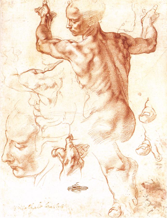
In the same book the author cites work by Michelangelo and Degas to further exemplify the distinction between the two concepts by offering the following (I have supplied an image for each artist although they are not the same images referred to in the book):
"In the Michael Angelo the silhouette is only the result of the overlapping of rich forms considered in the round. Every muscle and bone has been mentally realized as a concrete thing and the drawing made as an expression of this idea. Note the line rhythm also; the sense of energy and movement conveyed by the swinging curves; and compare with what is said later (page 162) about the rhythmic significance of swinging curves."


"Then compare it with the Degas and observe the totally different attitude of mind in which this drawing has been approached. Instead of the outlines being the result of forms felt as concrete things, the silhouette is everywhere considered first, the plastic sense (nowhere so great as in the other) being arrived at from the accurate consideration of the mass shapes."
Harold Speed, The Practice and Science of Drawing (New York: Dover Publications Inc., 1972) 66.


I sometimes like to think of the optical as the data our eye sees. It is compiled of non-representational shapes (masses) of patterns and color. It is associated with the 2-dimensional picture plane or an impression upon the retina. In contrast the conceptual is the mental understanding or visualization of what is being seen. It is the understanding of an object in terms of how the mind comprehends it based off prior experience or knowledge. It is often simplified or idealized to it make it easier to grasp. It is often associated with 3-dimentional, spatial, geometric and structural ways of thinking and problem solving. When this optical data is filtered through our conceptual understanding the result is our perceptional experience.


Ok, so why is all of this important. Well whether they are conscious of it or not it defines for many artists how they look at things and choose what to look for. Although greatly oversimplified, I have previously described impressionistic painters and classical painters thusly:

"The impressionist collects the data they see and presents the data to the viewer, who then draws a conclusion while the classical painter collects the data they see, draws a conclusion, and then presents the conclusion to the viewer."

More particularly when "seeing" how do these concepts define what artist's look for? Do they look for shapes(optical) or forms(conceptual)? Do they focus on the edges between shapes(optical) or the form's morphology between planes(conceptual)? Do they calculate the lightness or darkness of a stroke of paint by relating the values of various shapes(optical), or mentally visualizing the decay of light over a form(conceptual)? When they utilize a plum line, is it visualized structurally inside the object(conceptual) or at the picture plane like a line drawn on a window(optical)? When they start to draw a head do they start with the shapes they see(optical) or with some structural construct such as an egg form(conceptual)?


Realistically I don't think any artist's work is wholly formed conceptually or optically—although philosophically many seem to favor one approach over the other. For myself I think that all of the questions posed above, both optical and conceptual, are useful. I assume that they should lead me to the same conclusion. Yet that conclusion is formed by meeting my conceptually understood experience thus grouping me more as a classical painter as I previously defined it.

There is so much more that could be said on this simple distinction. However for the readers who are artists I hope it may make you more aware of how you see and for the art collector and enthusiast I hope it will give you more insight into the thoughts of the artists whose work you enjoy.

Just a little food for thought.

An Addendum passage from Harold Speed:


I have included a larger passage below from Harold Speed's book that ties into what has already been said. I wanted to add it on because it has been insightful to me but I couldn't see a good way of working it into what I wrote above.

"To sum up this somewhat rambling chapter, I have endeavoured to show that there are two aspects from which the objective world can be apprehended. There is the purely mental perception founded chiefly on knowledge derived from our sense of touch associated with vision, whose primitive instinct is to put an outline round objects as representing their boundaries in space. And secondly, there is the visual perception, which is concerned with the visual aspects of objects as they appear on the retina; an arrangement of colour shapes, a sort of mosaic of colour. And these two aspects give us two different points of view from which the representation of visible things can be approached.


When the representation from either point of view is carried far enough, the result is very similar. Work built up on outline drawing to which has been added light and shade, colour, aerial perspective, &c., may eventually approximate to the perfect visual appearance. And inversely, representations approached from the point of view of pure vision, the mosaic of colour on the retina, if pushed far enough, may satisfy the mental perception of form with its touch associations. And of course the two points of view are intimately connected. You cannot put an accurate outline round an object without observing the shape it occupies in the field of vision. And it is difficult to consider the "mosaic of colour forms" without being very conscious of the objective significance of the colour masses portrayed. But they present two entirely different and opposite points of view from which the representation of objects can be approached. In considering the subject of drawing I think it necessary to make this division of the subject, and both methods of form expression should be studied by the student. Let us call the first method Line Drawing and the second Mass Drawing. Most modern drawing is a mixture of both these points of view, but they should be studied separately if confusion is to be avoided. If the student neglects line drawing, his work will lack the expressive significance of form that only a feeling for lines seems to have the secret of conveying; while, if he neglects mass drawing, he will be poorly equipped when he comes to express form with a brush full of paint to work with."
Harold Speed, The Practice and Science of Drawing (New York: Dover Publications Inc., 1972) 47-49.

Saturday, May 1, 2010

Doing an Oil-Transfer

(Update 1/18/12) For a French translation of this post please click here for a downloadable PDF file:

In response to my last two posts I have received questions regarding how I transfer my drawings to my linen. I have done different things over the years but usually these days I do an oil-transfer. The main reason I like doing an oil-transfer is that it doesn't introduce any other materials such as charcoal or graphite into the painting.

Here are instructions for how to do an oil-transfer. The content has been taken from a handout I made up for my painting workshops:

OIL PAINT TRANSFER PROCESS:

Douglas Flynt © 2009, all rights reserved

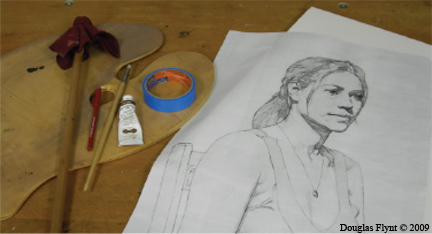
Here are the supplies you will need:

-Low Tack Masking Tape or Drafting Tape
-Red Ball Point Pen
-Mahl Stick or Bridge (to rest your hand on)
-Palette
-Large Bristle Brush
-Raw Umber (oil paint)


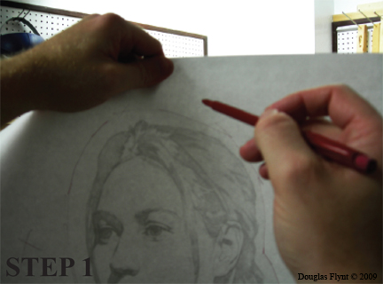
Step 1. Take a good photocopy (the darker the lines the better) of your drawing (or the drawing itself if the paper is not too thick) and hold it up to a light so that the image is facing away from you and toward the light. On the backside of the paper (not the side with the image) roughly outline the areas you will need to apply oil paint to, so that you don't have to cover the entire back of the paper.


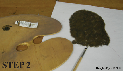
Step 2. Put out some raw umber on your palette (do not add anything to it). Using a large bristle brush, dry brush or scumble (scrub) the paint onto the back of your photocopy (the side without the image) in the areas you outlined in step "1." Try for an even, fairly thin coat.


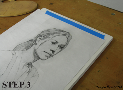
Step 3. Place your photocopy on your canvas or linen with the oil side face down, touching the canvas or linen. Be careful to keep the drawing aligned so that your image is not crooked. With your image carefully placed, securely tape one side of the paper to keep it from moving.


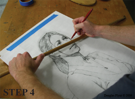
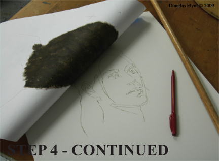
Step 4. Trace over your drawing using a ball point pen. A red pen makes it easier to keep track of where you have traced. Be careful not to rest your hand on the drawing—instead rest your hand on your mahl stick as you trace. Periodically (and carefully) flip up your image to make sure the transfer is working.


Step 5. With the tracing done, remove the photocopy and the tape. Allow the canvas to dry overnight—or more preferably, a few days.