Sunday, December 5, 2010

My Studio Lights

I often get regular questions regarding the kind of lighting I use in my studio. At this time I do not have the good fortune to have natural light in my studio. However during my studies I became somewhat accustomed to some of the characteristics of natural light and so a number of years ago I started experimenting with building my own light boxes to try and gain some of those characteristics. After building a few lights a number of other artists who saw them asked about building some for themselves and so I put together a few photos of how they were built. Below is a photo of how I often set up for small still life pieces and some shots that I took while makes changes to one of the lights. I thought I would share the process and the materials involved incase it is useful for others out there. And incase you're not the tinkering type, I also put some links at the end to some lights on the market which may serve you just as well. Have fun taking a look!


Here is the setup I often use for small still life pieces.  The light has a mixture of compact florescent bulbs—usually four 6500K bulbs and one 5000K bulb. 


Photo 1

Photo 2
Photos 1 and 2 show the basic body of the light. This is the first light I built like this and I took these photos while making some modifications to it—upgrading the older design. On this model I used nuts and bolts with lock washers to fasten things together. For future models I used rivets which I would recommend.


The 4 light reflectors are 8 inches in diameter. The aluminum frame was constructed with 1/16" by 1/2" "L" channel lengths of aluminum. The rivets are 1/8" "medium" length aluminum rivets. The basic outer dimensions of the frame are 16" x 16" x 6" (not including the light reflectors).


Photo 3
Photo 3 shows one of the 6" lengths of aluminum.


Photo 4

Photo 5
Photos 4 and 5 show the piece that I fabricated so I could attach a handle. These were attached at the center on two opposite sides of the 16" x 16" frame (side attached to the reflectors).  The piece was cut from an 1/8" thick "L" channel length of aluminum.  It is approximately 2" in length.  The hole has threads that accept a 1/4" #20 bolt.  It was created using a "T handle or a tap wrench" and the correct sized drill bit.


Photo 6

Photo 7

Photo 8
Photos 6, 7 and 8 show a smaller different light I constructed that has a "U" shaped channel (made by adding an extra "L" channel) on three sides. I later decided this was perhaps the best way to go in order to hold the diffusion lens to be made later.   The channel is a gap of about an 1/8th of an inch.


Photo 9

Photo 10
Photos 9 and 10 show an extra center light that I added by cutting down another aluminum reflector.  They also show the start and finish of enclosing the sides and rear openings.  To do this I used aluminum flashing and rivets. On the rear I left the four corner spaces open to allow for air to circulate, helping to dissipate the heat.


Photo 11

Photo 12

Photo 13

Photo 14

Photo 15
Photos 11-15 show the arm handle/bracket that I fabricated so that the unit can be tilted and mounted on a sturdy tripod. Most of the handle/bracket was constructed with 1/8" thick 3/4" "L" channel lengths of aluminum and 1/16" thick 1/2" "L" channel lengths of aluminum for the corner braces. At the ends that attach to the light's frame I drilled 1/4" holes for carriage bolts to go through. I then threaded a 1/4" # 20 carriage bolts through the pieces I had earlier tapped out (to create threads)—adding spacers, washers and large nylon wing nuts which can be tightened down so that the angle of the light can be locked in place.


Photo 16
Photo 16 shows a tapped out hole (to create threads) put at the center of the u-shaped handle/bracket so that the whole unit can be put onto a sturdy tripod.


Photo 17

Photo 18
Photos 17 and 18 show the diffusion lens in place and by itself. I cut it down from a 2' x 2' piece I purchased. I cut the corners off to allow for air to circulate dissipating heat. I also sanded the edges to remove sharp spots and lessen the likelihood of it cracking.

Photo 19

Photo 20
Photos 19 and 20 show the bulbs added and the light sockets attached. I later wired all of the cords together into one plug.

And finally the light in action again! As promised here are some links to some lights that should give a similar result:

http://www.bhphotovideo.com/c/product/479658-REG/Impact_VA903_VA903_Five_Lamp_Fluorescent.html

http://www.bhphotovideo.com/c/product/479659-REG/Impact_VA_905_Cool_Light_IX_Nine.html

Saturday, November 27, 2010

Workshops in 2011

Hi everyone,

For those of you interested, I wanted to go ahead and post the workshops and demonstrations I have scheduled thus far for 2011. As some of you may already know, I also offer private one-on-one workshops catered to an individual participant's particular questions and challenges. For further information on this type of workshop please send me an e-mail at:

workshops@douglasflynt.com

As always to check on workshop updates, read comments by workshop attendees, view online demonstrations, or view recommended books and websites, please visit the following link on my website:

http://www.douglasflynt.com/teaching.html

For those of you that are able to participate in a workshop or attend a demonstration I look forward to seeing you in 2011!

2011 Workshops and Demonstrations:


Demonstration: Portrait with Oils
(for the Portrait & Figure Painters Society of SW Florida, http://www.portraitandfigure.org/)
January 11, 2011, 10:30 am - 1:30 pm
(Cost: $10 members, $15 non-members)
Robb & Stucky Interiors Community Room
13170 S. Cleveland Avenue
Fort Myers, FL 33907


Workshop: Still Life Painting in Oil
February 28 - March 4, March 7 - 11, 2011 (10 day intensive)
(Cost: $875)
Artist's Studio Space
Fort Myers, FL
For more information please click here:


Workshop: Portrait Painting in Oil
March 21 - 25, March 28 - April 1, 2011 (10 day intensive)
(Cost: $975 - includes model fees)
Artist's Studio Space
Fort Myers, FL
For more information please click here:
 

Workshop: Still Life Painting in Oil
Summer, 2011 - exact dates to be announced (10 day intensive)
The Grand Central Academy of Art
New York, NY


Workshop: Portrait Painting in Oil
August 22 - 26, August 29 - September 2 (10 day intensive)
(Cost: Early Registration $1100, Due June 30th, 2011
Late Registration $1200, After June 30th, 2011)
Bay Area Classical Artist Atelier
Belmont, CA
For more information please click here:

Sunday, September 19, 2010

Using a Sphere to Understand Light on Complex Forms

(UPDATE 10/27/11 -For French translation of this post please click "here.")
Recently I received a question that concerns an earlier image I posted awhile back in the article, The Anatomy of Light on Form: Part II. Here is the image:


The question centers around how the use of a sphere, an object so very different from the complex forms of the cast, can help us to better understand how the light on this complex form (or other forms) works. And ultimately how we might utilize this knowledge to assist us in determining values and rendering.

My short answer is, that by understanding how light affects the simple forms of the sphere we can better understand how light affects the forms of a more complex object. However, this answer hardly seems adequate. For this reason I am going to endeavor to break down the connection between a sphere and a complex form further.

To do this, first I would like to start not with forms but with 2-dimentional geometrical shapes. First let's take an odd shape and place it next to a circle.


Let's say that we needed to replace a section of the odd shape's contour with a section of the circle.   In doing so we would find that any section of line (when averaged in our minds to a straight single tilt) from the odd shape has a corresponding section of line or tilt (again when averaged to a straight line) within the circle.  This is assuming that we could not rotate the sections of line if we removed them from their shape. 


It might also be mentioned that although the corresponding sections from the circle may be a close match in terms of their tilt or pitch they might not be the correct scale in terms of their size, this however could be overcome by using circles of different sizes.

So now we realize that a circle, in essence, contains all of the same line segments (averaged in or minds to straight lines), with their unique tilts or pitches, that we would find on a unique shape.

We now need to apply this same concept 3-dimensionally to the sphere and the cast that we originally looked at in our first picture. Instead of considering line segments (averaged to straight lines) we now need to visualize the form of the sphere and cast as averaged to planes. The following image might help you visualize the sphere with planes:


Each plane on the sphere has it's own value in relation to how much light it receives.  Just like with the odd shape and the circle, if we consider the spatial orientation of a plane on the cast and find its corresponding plane on the sphere they both should be the same value (value equating to their pitch or spatial tilt), assuming they both are under the same lighting conditions. 


This can lead us to begin to look less at the optical value of a plane and more at its spatial orientation in relation to a light source.  On a complex form the amount of light a plane receives might be somewhat confusing to interpret but the same plane thought of in the context of a sphere reveals how much light it is receiving quite easily.  Utilizing this conceptualization, it can be easily determined if a plane belongs to a region such as a halftone, or a highlight, not so much based upon its value but upon its orientation in space and context as part of  the sphere. 

For instance in the image of the faceted sphere from earlier, the plane that appears as a highlight is rather obvious.


An artist painting the cast trying to identify highlights might not look for spots of light tone to identify them but instead look for planes that have the same corresponding spatial orientation as the highlight plane on the sphere.


Visualizing a sphere can be a conceptual way of keeping track of the part and the whole while still focusing only on a particular part (or parts) of a complex form. It is often noted that when painting in a "window shade" or "area by area" manner an artist may have a hard time keeping track of large value relationships—a problem of keeping track of the part in relation to the whole. This trouble can be overcome in some respects by conceptually referencing a real or imagined sphere under the same lighting conditions and then comparing planes from the object to the corresponding planes on a sphere. This is not entirely dissimilar from taking a road trip and tracking your progress on a map to maintain a sense of where you are, where things are in relation to you, and how much further you have to go.

Comparing two planes on the cast and then analyzing both on a sphere can also be a great way to compare their relative spatial relationships to aid in assigning them relative values. For instance two planes facing very much toward the light on the cast might appear to be almost the same value. However if you wish to make a very subtle distinction between them you could easily decide which is lighter and which is darker by plugging them both into a sphere and seeing which one receives more light. It might also be noted that despite one being darker than the other neither can get very dark in value because they are both very much out in the light and a great deal of planes exist on the sphere between them and the darker planes of the half tones.

These kinds of conceptual thoughts using a sphere can allow for very subtle distinctions between tones that optical assessments alone might not allow for.

This all leads back to my original explanation for using a sphere, where I stated that by understanding how light affects the simple forms of the sphere we can extrapolate to better understand how light affects the forms of a more complex object. As with many of the subjects that I have written about on this blog this line of thought could be explored in a much more full and robust discussion—but alas, my schedule doesn't permit me to do so.

Yet perhaps the next time you're painting an object you might just think about a sphere along side it and see if you begin to understand things differently, and consequently "see" in a slightly different way than perhaps you did before.

Thanks for taking a look!


Saturday, August 21, 2010

DIFFUSE TRANSMISSION AND TASTING THE RAINBOW

(UPDATE 10/27/11 -For French translation of this post please click "here.")  
 
DIFFUSE TRANSMISSION

I have had a few requests to discuss how "diffuse transmission," which makes up the appearance of translucency, works.

Because I paint a great variety of materials in my still life work I encounter diffuse transmission quite regularly—perhaps in the light passing through milk (Figure1) or the light passing through the thin wall of a shell (Figure 2). However I also encounter it when doing figurative work and this seems to be where many people really take notice of it's effect—perhaps when looking at the intense high chroma reddish, orange seen in the ears of a person who is backlit.


Figure 1.  Black and White 8" x 6" Oil on linen


Figure 2.  Understanding Phi 10" x 16" Oil on Linen


As its name implies diffuse transmission deals with the diffuse component of light. And because this light has passed through the object it is described as "transmission." Diffuse transmission is composed of light that has entered a material, undergone subsurface scattering (losing wavelengths to absorption in the process) and then has been emitted back out of the material on the shadow side of the object. It is actually the same process as "diffuse reflection" except that the light has exited the material on the shadow side, instead of the light side, of the object. For this reason we should expect to observe diffuse transmission mainly on the shadow side of an object. On translucent materials that have some substantial thickness (such as a sphere vs. a sheet of paper) the diffuse transmission will appear just past the terminator or shadow line.

In terms of its affect on the appearance of color, diffuse transmission is usually darker in value than what is seen on the light side of the same object. This is due to the loss of light through absorption as the light passes through the object. However it will be higher in chroma than the color found on the light side of the object. This is because only certain wavelengths were absorbed, in effect filtering out some wavelengths while allowing others to pass through. It has been my experience that there may also be some shift of hue (often very slight) from what the local color appears to be on the light side of the object. Sometimes this may be because as the light travels through the object it encounters different layers of materials (each material absorbing different sets of wavelengths. However, I have often wondered if there are also other factors at work, based more on our perceptions with different relative proportions of wavelengths stimulating the eye differently—however that is something to be contemplated further at another time.

TASTING THE RAINBOW

For a greatly simplified analogy, to understand what has already been stated, lets say I find myself with a huge bowl of Skittles candy that represents a certain quantity of light. Each candy with its own color might be a particular photon with a particular wavelength. I am standing on a stage in a filled auditorium with the audience representing all of the atoms that make up a particular object. In this analogy each person in the audience only likes a particular color of candy but for some reason no one in the room likes green.

A Bowl of Light

I begin to toss out handfuls of Skittles to the first row which they proceed to eat assuming they get the color of candy they like. If they don't like the color or they are currently eating a piece, they can pass it on to someone else. However they can only pass a Skittle on 10 times. If no one eats it in that time they proceed to toss it back up onto the stage. This candy on stage makes up diffuse reflection. There is less candy than what we started with (hence less light) and although some of all of the colors should end up back on stage the proportion of green Skittles should be much greater (giving the appearance of green).


Diffuse Reflection

After all the leftovers are back on stage the audience having just started to work up a sugar high demands an encore! Not wanting to disappoint them I break open some new bags of skittles filling back up the bowl and start the process over again. However realizing that many people in the rows further back never got any candy the first time I allow them to pass on the candy 50 times. This time if no one eats it I ask them to toss the leftovers toward the lobby entrance in the rear of the auditorium. This time the candy left here makes up diffuse transmission. There is a lot less candy than what we started with (hence even greater loss of light) and a very large proportion of green Skittles (giving the appearance of a very high chroma green)


Diffuse Transmission

CONCLUSION

Very often the phenomenon of diffuse transmission causes us to see beautiful glows of high chroma on an object or in spots throughout a scene. Accurately understanding what is occurring helps in capturing these glows with paint ( through "relative" relationships of color or "absolute" color matches). Getting this effect right communicates to the viewer the type of material being represented, giving a "truthful" or "realistic" effect and can also be beautiful in an aesthetic sense at the same time.

Thanks for taking a look!

Sunday, July 25, 2010

The Composition of Light and J. G. Vibert

(UPDATE 10/27/11 -For French translation of this post please click "here.")
I was recently reading "The Science of Painting" by J. G. Vibert and came across a section where he discusses understanding the local color of an object in terms of the color spectrum of light and which wavelengths are absorbed vs. reflected. Here is a brief excerpt:

"If, on the contrary, a body sends back a part of the light received, and decomposes the rest, the colour of the coloured ray or of the mixture of coloured rays which it will send back will be of a colour more or less light, according to the quantity of light sent back.

Example: —A body which sends back the half of the light received, decomposing the remainder, and sending back only the red ray, gives the impression of half-white and a seventh of half-red, i.e. pink."
J. G. Vibert, The Science of Painting, trans. (from 8th edition) and ed. J. G. Vibert (London: Percy Young, 1892), 22
Online text of book:
http://books.google.com/books?id=LO8DAAAAYAAJ&printsec=frontcover&dq=The+science+of+painting+vibert&source=bl&ots=VGmKXHT7wr&sig=D__AAeHVIyvRXcOwfiA4uYgFh14&hl=en&ei=IjdMTIGxOoS8lQeNwMj4DQ&sa=X&oi=book_result&ct=result&resnum=1&ved=0CBcQ6AEwAA#v=onepage&q&f=false

Images of J. G. Vibert's work:
http://www.artrenewal.org/pages/artist.php?artistid=134
I found the text interesting because I sometimes think of a model which examines the light wavelengths present to keep track of the appearance of an object's color (in terms of hue, value and chroma). I make use of this model both in my own work and also in my teaching and thought I might share some of that information here.

I should point out that this model is not entirely truthful when dealing with the resulting color we perceive based upon the composition of light. I will endeavor to clarify this problem later in the post. Despite this flaw, as a model, it consistently works to keep track of how the color of an object appears to change based on the light it receives and then reflects.

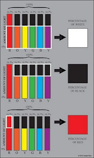
As I have discussed in previous posts, light is composed of many different wavelengths and for our model I am going to classify them into 6 groups, namely red, orange, yellow, green, blue, and violet


(Note: This is different from Vibert who uses 7 colors—perhaps influenced by the writings of Newton.)
Newton's Color Wheel
To visualize the model I think of the colors in the form of a bar graph. All of the bars together add up to 100%. However, each bar individually only contributes about 16.7%. If all colors of light are present in a very high degree this translates to appearing very light in value. In this same scenario because all wavelengths are present they will neutralize one another giving the appearance of a neutral (achromatic) color. In this situation the resulting color would appear white.


(Note: The percentages of light in the diagrams and the resulting color are highly approximated. They are mainly for offering a rough visualization of the concept being discussed)

The absence of light would of course appear as black.


With less overall light present but all colors in equal proportion the result would still be chromatically neutral but darker in value—giving the appearance of a grey.


Along these lines and speaking in terms of the appearance of objects as composed from their reflected light, rather than the light source itself, Vibert offers the following:

"A body which absorbs part of the light and sends back the rest is grey. The whitest objects, therefore, are only very light grey, and the blackest very dark grey. However, the light which a grey body sends back is the same as that which is sent back by a white body: the difference is merely in quantity."
J. G. Vibert, The Science of Painting, trans. (from 8th edition) and ed. J. G. Vibert (London: Percy Young, 1892), 21
Continuing with the model being presented, if only one color is present the result will be that hue. Because there are no other colors present this color will be at its highest chromatic intensity. However since there is less light present overall it will have darkened in value.


As there is less light of this particular color present it will continue to darken in value and appear to weaken in chroma.


If one color is present in it's full percentage but we add back in the other colors in equal proportion this increase in the amount of light will cause the value to lighten but the chroma to weaken.


In looking at the model it may be useful to imagine the percentage of all colors equally present as equaling that percentage of white, the absence of light as equaling that percentage of black, and the percentage of color(s) present individually (not already included with our white percentage) as equaling the percentage of that color. By then combining these together we get some sense of what the resulting color might be. The following diagram should make this easier to grasp.


It needs to be mentioned that this model of light as it has been presented so far is based on the composition, or mixture, of wavelengths an object would reflect assuming full illumination. With less illumination, such as is found upon planes of an object "turning" from a light source, this "mixture" would be the same, but there would be less of the "mixture" overall. The result would cause the appearance of the local color's mixture to darken in value and weaken in chroma.


I mentioned earlier that there is an untruth with this model. This untruth lies in the fact that our perceptions of colors are due to combinations of various wavelengths so that just because we see a color does not mean that those light waves are actually present. A great example is that the screen you are viewing is composed of only 3 colors of light which are red, green and blue. Despite this you have experienced the color of orange in the diagrams I offered. However for our purposes the model will yield consistent perceptual results in trying to understand the relative changes to the appearance of objects when observing the loss or addition of certain assumed wavelengths—for instance when dealing with reflected light since the reflected light will have a different composition of wavelengths than the original light source.

There are many ways we can use this model to help explain what we see but they are more than I can post at this time. Perhaps in a future post I can use the model to explain particular examples—for instance how the reflected light from an object reflecting back onto itself can cause the object to appear even higher in chroma, even when there is less light present such as in a shadow.

Thanks for taking a look.

Wednesday, June 30, 2010

"Dollars and Cents"

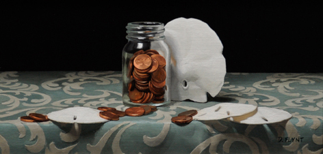
For this post I thought I would share a recently finished painting entitled "Dollars and Cents." It is a small piece at only 6" x 12" and was painted in oil on a mounted linen panel.


This particular piece is currently in transit to Nantucket, MA where it will be available for purchase from Cavalier Galleries.

You can visit their website by clicking on the following link:
http://www.cavaliergalleries.com/html/home.asp

Thanks for taking a look.

Wednesday, June 16, 2010

Update on the Link between Value and Chroma

(Update 1/18/12) For a French translation of this post please click here for a downloadable PDF file:

After my last post I had an e-mail exchange with Dr. David Briggs (who I had referenced in the post). He had some further information to share regarding the subject I was writing about along with some accompanying images. The information he shared concerns the anticipated trajectory through color space that occurs with a loss of light—particularly a distinction between computer color space models such as HSB or HSL and Munsell Color Space.”

HSB, HSL: http://en.wikipedia.org/wiki/HSL_and_HSV

Munsell Color Space: http://en.wikipedia.org/wiki/Munsell_color_system

In light of this new information I wanted to share his comments and images.  You will find the images directly below his text.


Dr. Briggs said:

"These lines we are drawing represent the set of points where, as brightness varies, the balance of wavelengths remains the same. Technically, these are called lines of uniform "chromaticity". As I've said on Dimensions of Colour, these lines maintain uniform HSB "hue" (H) and "saturation" (S), and appear in YCbCr space (the space I used for many of my illustrations) as perfectly straight lines radiating from the point of zero light energy.


More recently I've been looking into how these lines appear in Munsell space. The Munsell chroma scale fundamentally has a visual basis, and there is no in-built theoretical relationship between chroma and saturation. Nevertheless Ralph Evans reported that when projected onto a hue plane, paths of uniform chromaticity (and therefore uniform saturation) delineate simple straight-line relationships between lightness and chroma (Fig. 1, from Evans, The Perception of Colour, 1974). Surprisingly at first, however, these lines radiate from a point roughly one and a half Munsell value divisions below the Munsell zero value. I believe that this is because the Munsell zero value represents the light energy at the visual threshold of blackness, while the chromaticity lines are radiating from the actual point of zero light energy. Perhaps also surprisingly, for many hues these lines are somewhat curved when viewed on the hue plane; that is, as brightness changes they drift slightly in Munsell, i.e. perceived hue (but not in HSB "hue", H). Zsolt Kovacs' wonderful program drop2color has a facility for factoring in different brightnesses of illumination on paint colours, making it easy to illustrate these paths (Figure 2, 3).

I think an important practical consequence of these relationships is that the shading series for a brightly coloured surface goes nowhere near black paint! (Figure 2). This would explain why black paint is unsatisfactory as the darkest value of strongly coloured objects - for these it seems you might need to use the highest-chroma deep dark you can hit. I'd be very interested to know if you agree."

Figure 1:


Figure 2:


Figure 3:


The implications are that the premise for the trajectories I offered in the post will continue to hold reasonably true in computer color space models such as HSB but that a visualization for this trajectory in Munsell Color Space would be somewhat altered. When visualizing the trajectory in Munsell Color Space we need to visualize a base line trajectory from an object’s local color to a location below Munsell’s zero value. Additionally, a certain allowance would have to be made for some slight hue drifts from a true straight line trajectory.

I hope that others will find this information useful just as I did. Thanks David.

Sunday, June 13, 2010

The Link between Value and Chroma


(Update 1/18/12) For a French translation of this post please click here for a downloadable PDF file:

Since posting the articles about light on form I have received a number of questions regarding the link between chroma and value. Because of this, I thought I would put together a few diagrams to help illustrate how I think about the two. Please keep in mind they are approximated for illustration purposes only and are limited by my inexperience with the software programs I created them with.


In order to understand how value and chroma are related I first distinguish between the specular and diffuse components of light (which I discussed in the earlier articles). With this distinction I can analyze what is happening to both separately. In areas of diffuse reflection (form-light) the appearance of value and chroma are linked because they both shift with the amount of light the surface receives to begin with. As I previously explained in The Anatomy of Light on Form: Part I:

“As the surface angles away from the light source fewer light rays, or streams of photons, can strike any given unit of surface area. Fewer striking light rays means less light is later re-emitted to carry the information about the local-color of the object to our eye. Absence of light is perceived as darkness or achromatic blackness—as when all lights are turned off. With less light reflecting the local-color back to the viewer's eye the amount of darkness increases causing the local-color's appearance to simultaneously darken in value and weaken in chroma”
http://douglasflynt.blogspot.com/2010/04/anatomy-of-light-on-form.html
It is useful to think of areas composed of specular reflection (like high-lights) as obscuring or overriding the diffuse reflection one would normally see. It is also good to remember that the more light an object receives the greater its potential to display its true local color as long as the areas being viewed are not affected by specular reflections. In areas of form dominated by diffuse reflection the greater amount of light will visually increase the chroma (getting us closer to the object’s true local color) rather than “washing it out,” as is often seen in an overexposed photograph.


Within a color space model such as Munsell color space, once the local color is known (found where the object receives the most light not obscured by specular reflection) a straight line proceeding from that point toward the bottom center (achromatic black) displays the trajectory its appearance will follow as the light diminishes. This path also reveals the linked rate of darkening in value and weakening of chroma that we should expect to see.

For myself I don’t actually chart this trajectory for given objects but approximate it by eye and feel as I paint. This is much in the same way as I might conceive of an object’s vanishing point in space without actually drawing in the orthogonal lines used in perspective drawing.

The following image shows a much approximated rendering of an orange sphere and a slice of color space (again much approximated in both its construction and line trajectory) containing the color pathway the loss of light would create.


The next image instead shows the deviation from that path which would occur if we were to go through a region of specular reflection in the form of a highlight and assuming a achromatic (white) light source. In this highlight region the pathway will move toward the upper center of color space (achromatic white) and then return to the original pathway upon exiting it.


It should be noted that this pathway may in reality be further altered by other factors such as diffuse inter-reflection (reflected light) or diffuse transmission (translucency).

The following images show another example of these pathways for a different local color.


I hope the illustrations I have offered give a sense of how a person might conceptualize the relationship between value and chroma. Thanks for stopping by.

For more authoritative reading on this subject I would highly recommend David Briggs’s website, http://www.huevaluechroma.com/. The following excerpt further addresses what has already been said and also denotes that the main path of diffuse reflection in color space (without other variables) falls along a “line of uniform saturation:”


“If a surface of uniform colour turns progressively away from a single light source, the diffuse reflection from its surface steadily decreases in brightness. We would of course expect to represent this in a painting with a series of colours diminishing in lightness, but what would be the chroma of these colours? The answer lies in the fact that because the colour of the illuminant and the colour of the surface are both constant, the proportion of the different wavelengths in the reflected light will not change. Consequently the hue and saturation of the reflected light remain constant, while the brightness diminishes. The series of colours we use to represent such a surface, here called a shading series, should therefore lie along a line of uniform saturation; such lines radiate from the black point of the colour solid (Figure10.1). Along such a line, chroma decreases steadily as lightness decreases, at the precise rate necessary to keep the saturation of light from the surface constant.”

http://www.huevaluechroma.com/101.php